RapidAssist
naming | logo design | brand identity | app UI design
RapidAssist is an intuitive, highly secure, cloud-based system designed to easily and quickly locate, track and communicate with people during an emergency. The system works with a mobile app to enable emergency response teams to provide resources and a targeted effort to areas and individuals that need help—achieving the best possible outcome by obtaining accurate location and situational details of users in seconds.
When we started working with Rob and the team they had a business plan, plus a working beta of the software platform and app. We were engaged to develop a name for the system, design a logo and app icon, create a basic brand style guide, and develop the UI for the mobile app. We also worked on the look and feel of the backend software as well as the promotional assets required for hosting a mobile app on the Apple App Store and Google Play store.
We began the naming process with word-mapping to find terms and name combinations that best described the app and the benefit it provides to its users.
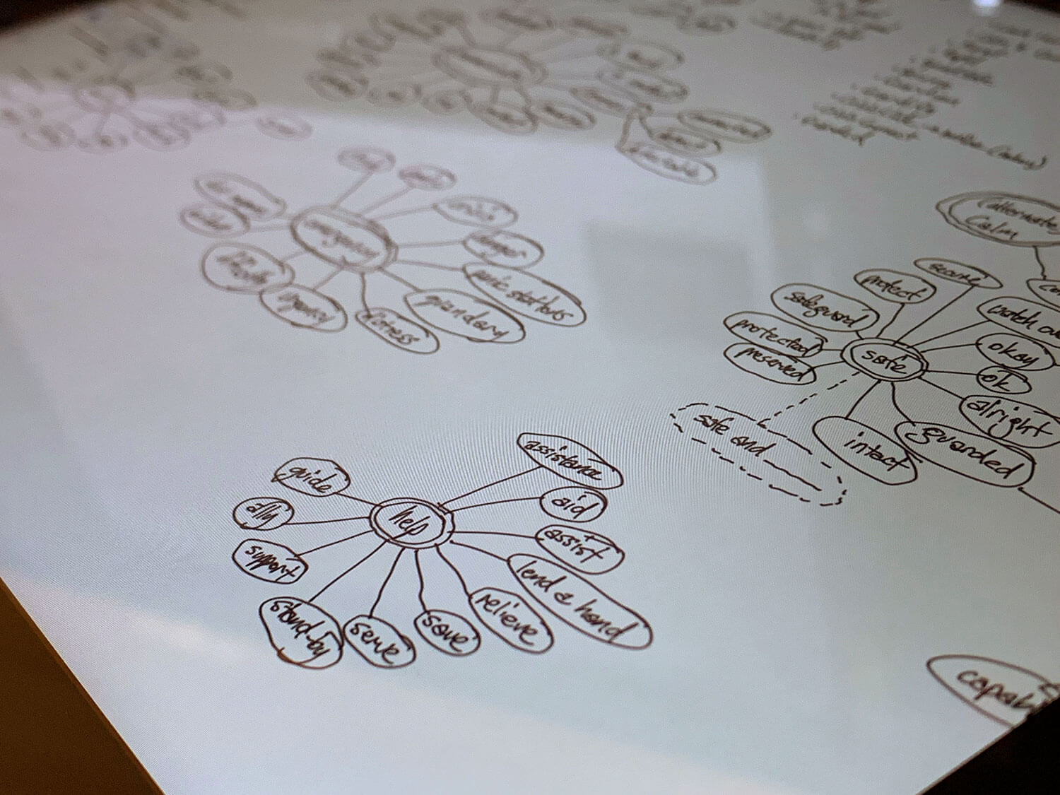
Once we’d worked through the process—including checking name and URL availability—both we and the client decided on ‘RapidAssist’ which represents the immediate nature that the app can alert authorities to someone’s requirement for assistance and their exact location.
With the name decided we moved onto the logo design which was informed by the original word-mapping and understanding of how the app functions for its users.
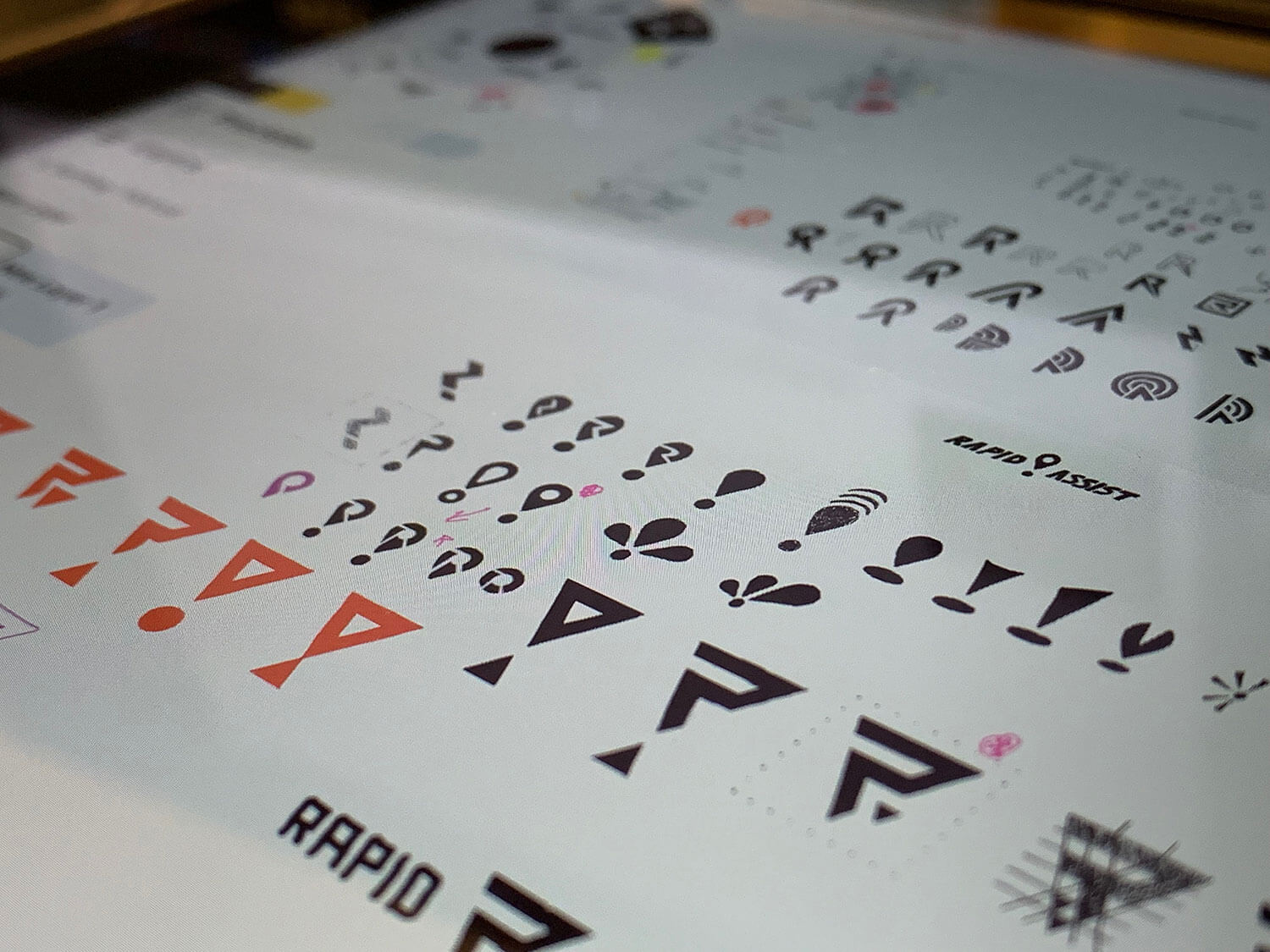
The chosen design is a red location pin that features a stylised R for RapidAssist. The circle in the middle also represents the user, with the radiating lines representing both escape routes and directions, plus emergency services coming from different directions to provide assistance. It also creates a sense of connecting different parts, representing the app, the users, and the control management side of the application.
Being an app first and foremost, creating a strong logomark (icon) was critical to allow development of app icons and other design elements. The logo was developed to have landscape and portrait versions to ensure flexibility of use.

A basic style guide was designed to create consistency across promotional materials, the app design, and the website that would be developed before the official launch. This contained fonts and font styles, duotone image specifications, a list of brand colours, and information on the family of logomarks and logos. The client opted for just a basic style guide as most of the design work was going directly into the app UI.

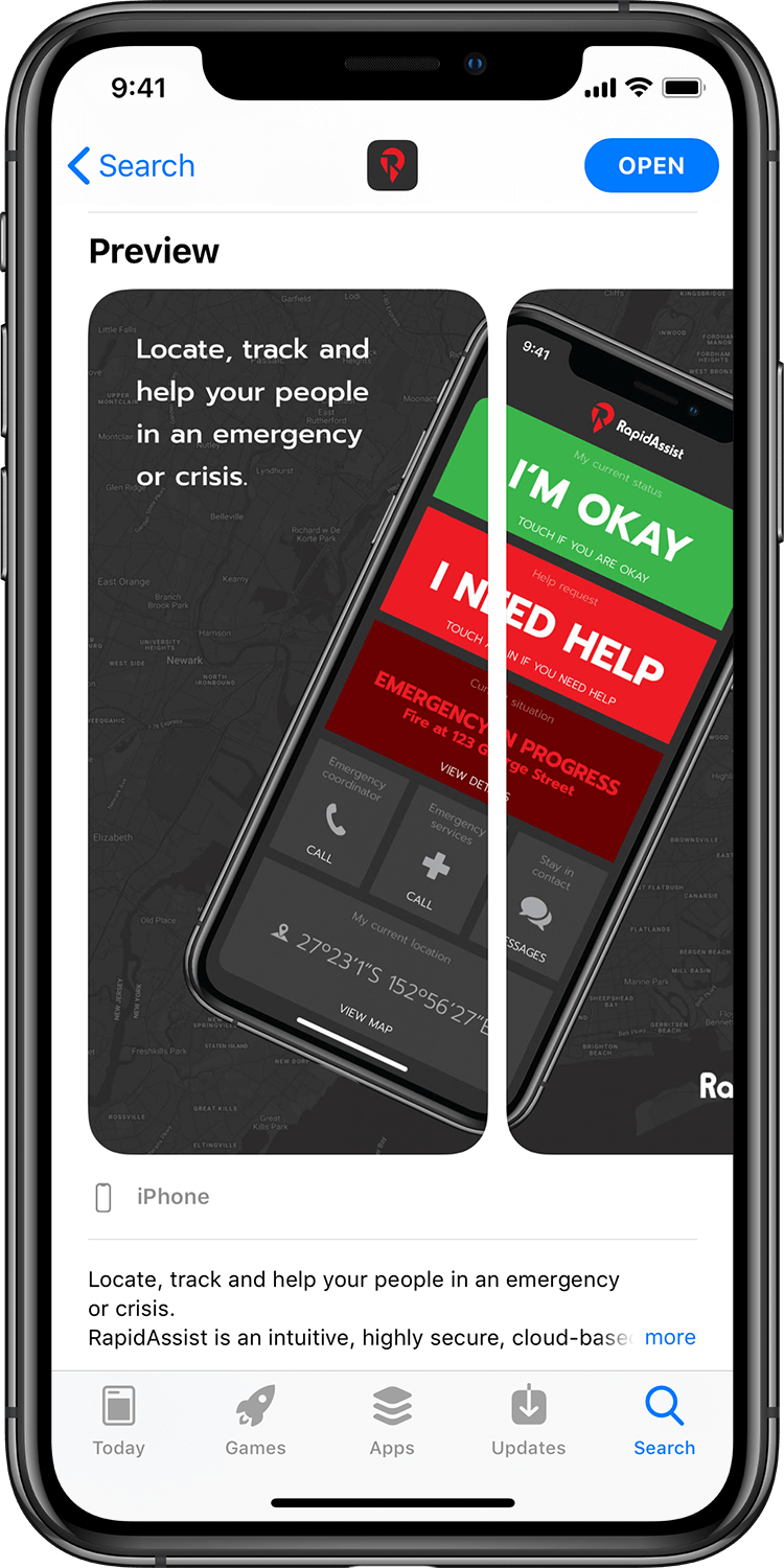
Once the brand style was established we set to work taking the existing beta app layout and applying the new brand design. We also spent considerable time looking at priority of information and usability—particularly as most screens and interfaces would be used by people in danger or distress. Clarity and ease of use were key, but it also needed to look attractive to create a positive user experience.
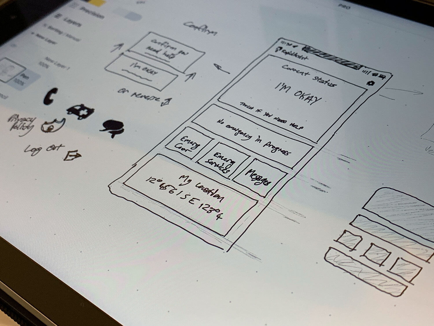
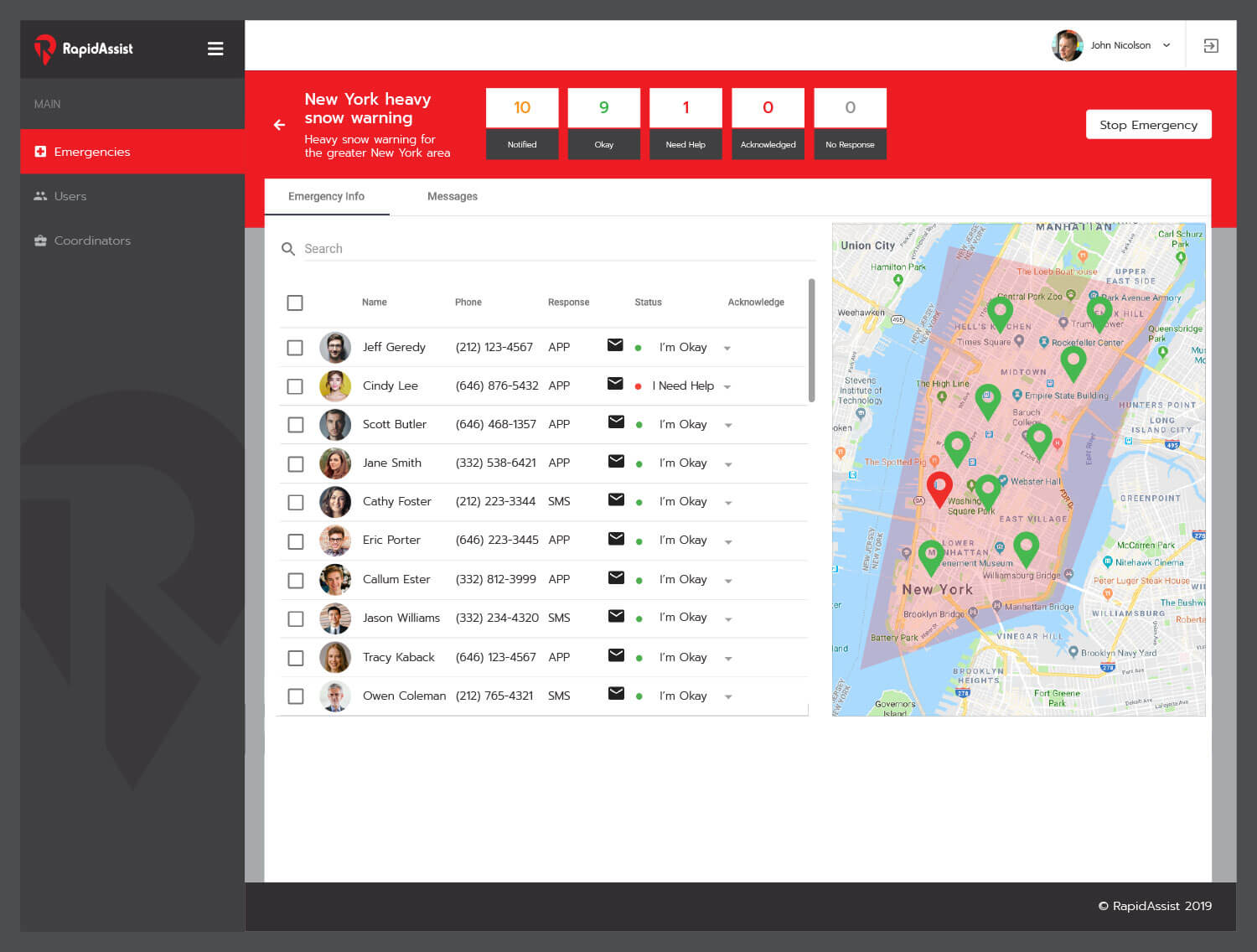
We designed a large array of screens for the app: from the initial user signup screen, through to the main interface, instant messaging, and other function screens throughout the app. These were supplied as design assets to the development team to implement into the actual app. We also worked on the look and feel of the backend part of the software, bringing across the new brand design into the existing software layout.

Finally we created an app icon and preview screens for the two app stores. The Apple and Google stores both had unique artwork, and the Apple submission had two versions to suit older and newer devices. The previews were designed to be engaging and attractive while giving viewers a concise and useful overview of what RapidAssist is all about. Some of the screens were split across two tiles to create additional impact and visual interest.

