Manasons
messaging | logo refinement | brand identity | graphic design
When directors Nancy and Mick first settled in Brisbane, they were stunned at how challenging it was to find a home with all the qualities they felt were important—so they decided to build their own. The excitement of turning a piece of land into a beautiful home was so addictive, they did it over and over again. Inspired by the love of creating, Manasons was founded and they have now designed and built a number of properties across inner city Brisbane.
Evocative got involved when the owners identified a disconnect between the premium quality homes they were building and their existing brand which wasn’t conveying the true purpose and passion behind their company. We worked to refine and articulate the amazing wealth of knowledge that the directors have, and present the brand in a way that connects and speaks to their target audience.
We started by refining the existing logo. Manasons had already been etching the stone motif onto the letterboxes of each new property they built, so it was key to retain this element. We removed the superfluous elements, fixed up some of the ‘stones’, and refined the logotype by reducing and adjusting the kerning of each letter.

This process allowed the brand equity to remain while making the logo clearer and more premium. We then looked at the key messaging which centred around their large luxurious houses that are positioned on smaller blocks that require little-to-no maintenance. As such we focused on professional families or retirees that want the nicer things in life and plenty of space to entertain … but don’t want to be burdened with the effort and expense of looking after a larger property. We developed the tagline: ‘live the premium lifestyle you deserve’ which speaks of customer benefit rather than ‘we build high quality homes’.
'You’ve worked hard and have acquired an appreciation for the finer things in life. Now you’re wanting to upgrade your home but don’t want an expensive, high maintenance property to look after.'
'It’s time to live the premium lifestyle you deserve.'
We created a range of messaging and written content, then worked on the brand design in terms of logo formats and refining the colour palette.
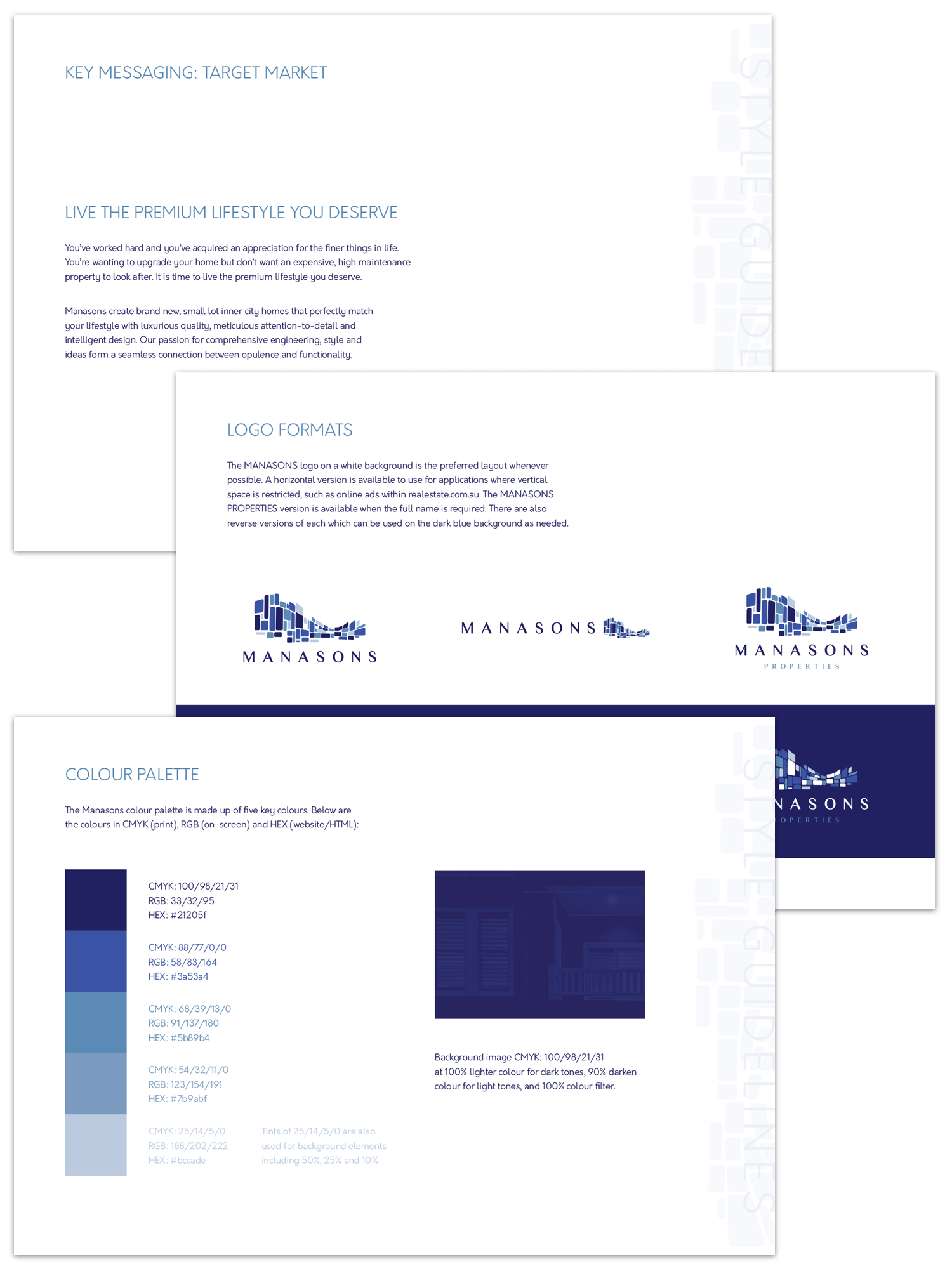
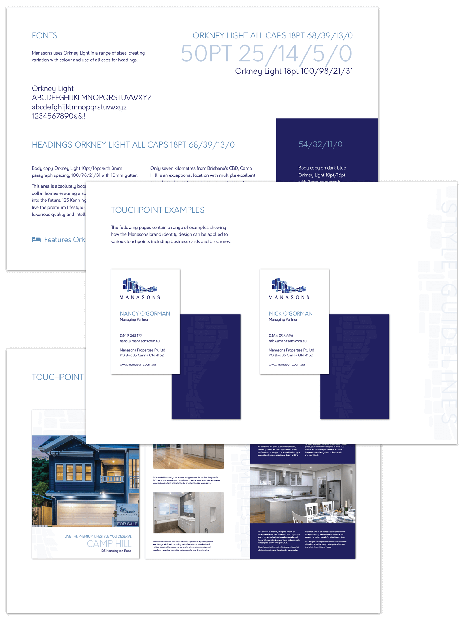
As part of the brand design style guide we selected a new font family with a range of guidelines for layout. We then created some touchpoints to bring the brand design to life, including updated business cards and a new layout for the sales brochures.
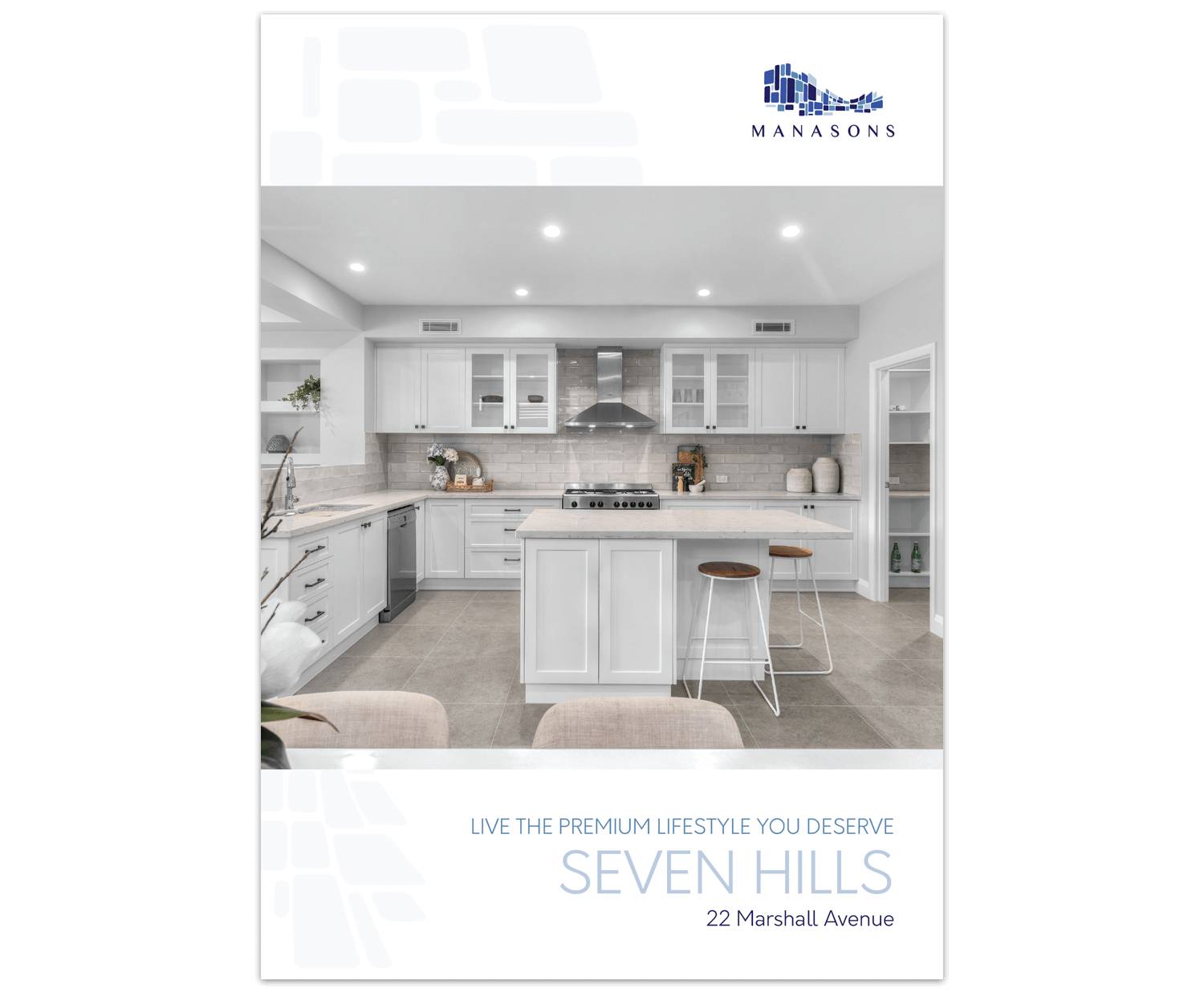
The brochure design has a clean premium feel that uses the subtle ‘stone’ motif throughout. The front cover features a hero image that showcases each individual property’s best feature—in the case of 22 Marshall Avenue this was the spectacular kitchen. The tagline is the first thing to introduce the property, followed by the location which is paramount in Real Estate promotion.
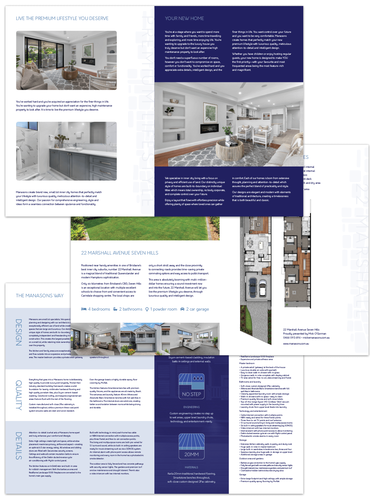
Inside it’s all about priority of information that’s important to the customer. The first spread talks about WHY the customer would want to live in one of Manasons’ homes, and uses language including ‘your new home’ rather than ‘our building process’. We broke down key information in the following pages to make it easier to understand and read—so even if they don’t read all the text, words like ‘design’, ‘quality’ and ‘details’ are still obvious as core values. Custom designed icons also help tell the story in an engaging way.
Once the brand design was complete, Nancy took the updated content and priority of information, and updated the Manasons website to reflect the brochures. The result is a very clean and stylish design that delivers the key messaging in an attractive and logical way.

You can visit the Manasons website at manasons.com.au to see their latest property listings, learn more about their small lot inner city homes, plus get some new home advice from their blog.


