Infinite Print
messaging | naming | logo design | brand identity | illustration | website design
Wendy had been working as a print broker when she decided the time had come to do things her own way and become her own boss. She also wanted to start attracting larger clients and projects—particularly via the project management side of the business. The new business was essentially made up of three aspects:
- As a service: print broker for business clients, providing advice, quotes, print management, and project management.
- Physical products: off-set printing, digital printing, large format printing, specialty printing, letterpress, embellishments, signage, packaging, and more.
- Project management: organising signage installation, putting together complex projects such as book production via multiple suppliers, and other projects where multiple components need to work together to create a product.
After the OUTLINE phase we started working on the NAME and WRITE phases, creating a unique and meaningful name for the new business; then creating taglines and written copy to tell the story of benefit to customer.
Out of a long list of potential names, the word 'infinite' stood out with its meaning of 'immeasurably great, unbounded and unlimited'. As Wendy's business isn't restricted to any specific machine or print process, there's literally unlimited possibilities in terms of what and how print collateral can be produced. From here Infinite Print was born along with a collection of taglines, phrases and copy.
'Unlimited possibilities in professional printing.'
'Complete professional print management from concept to delivery. If it can be printed, Infinite Print can produce it for your business!'


Once the name and positioning was established, we started the ideation process in the DESIGN phase to create a logo and brand design fitting for Wendy's approach and industry. While various concepts were explored, we kept coming back to the infinity symbol as a clear link back to the name and meaning. After creating a range of more stylised designs, the final concept was simpler and more literal in terms of representing process via paper curling over two invisible rollers. The design not only features two subtle infinity symbols, but also paved the way for creating a series of patterns that repeat infinitely.


The Infinite Print logo is made up of a logomark and logotype. The logomark symbolises the flow of paper through the press while incorporating the infinity symbol. There is also reference to Infinite Print’s journey with the customer: from the initial project idea progressing through to the delivered product. The infinity symbol connects to the name which refers to the infinite printing possibilities that are available to Infinite Print’s clients.
The logotype is all lower case in a slightly customised font. The round dots on the ‘i’s and paper-like tails on the letters ‘t’, ‘e’ and ‘r’ reference the rollers and print stock. The ligature that joins the ‘f’ and ‘i’ also make reference to the printing process. The letters match the logomark with a combination of straight edges and corners that mix with a number of rounded shapes.
With the logo created we then developed a unique colour palette complete with meaning via colour psychology, which was then translated into a pair of 'swirl' devices that create liquid, holographic metallic effect—symbolising creativity, process and the various embelishments that makes the print industry so exciting. We also created a tagline lockup for the 'unlimited possibilities in professional printing' that features the logomark.


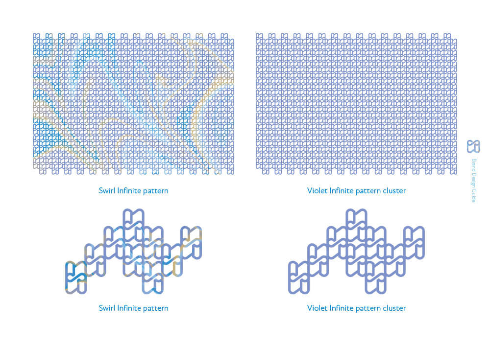
The Infinite pattern was designed to have a full pattern that can be extended to any size, plus a smaller 'cluster' version that is suitable for use alongside other brand design elements. Both swirl and violet versions were created to make the patterns cohesive and complimentary to the rest of the brand design.

A range of touchpoint examples were designed to showcase how the brand design translates into real life applications. Business cards and a paper kit mockup were created, with the paper kit demonstrating how the brand would adapt to various paper stocks and printing techniques.
In addition to the typographics and patterns, a series of illustrative and photographic styles were created for the backs of the paper kit cards. These feature 'cool' things including retro cars and girls, and 'anything's possible' things including a unicorn, dragon, and a floating city.
Some of these concept illustrations were then formalised for the website design, which included creating a Brisbane version of the floating city.


As part of the website design we worked to avoid the typical generic printing product images by created an entire suite of custom designed product images. These included a book cover, brochures, stationery, packaging, cards, plastic cards, stickers, magnets, signage, banners, flags, posters, a lectern, a promotional mug, carbonless books, specialty print item, envelopes, a specialty card, and a screen printed T-shirt.
We then integrated these items along with the rest of the brand design assets and illustrations, to create a website design that was then handed to the web developers that Wendy had commissioned.


Wendy has expressed her absolute delight in the new brand design, both in person and via this Google Review:
'Ben and Renée created my brand from start to finish for my recently launched new company, Infinite Print. Working with them was a fun and exciting experience. The final result showed that they really had taken the time to know the real me and what I was about. The support I received from them was immeasurable, they went above and beyond. I highly recommend them to anyone who is looking to brand or re-brand their business.'
You can visit the Infinite Print website at infiniteprint.com.au


