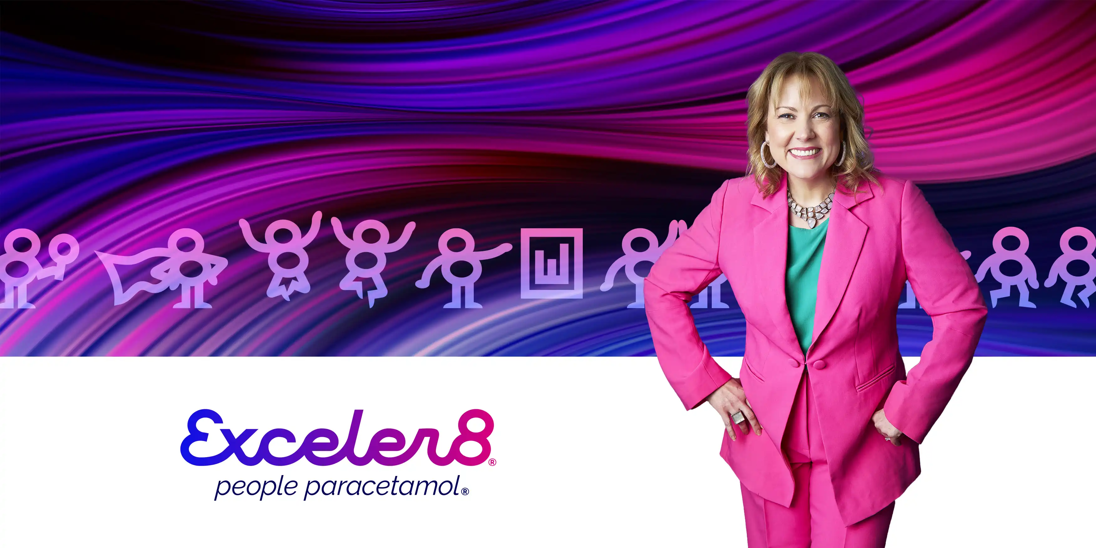
Exceler8
logo design | brand identity | illustration
Exceler8 was originally created by current owner Melissa’s father, as a business advisory firm. Melissa eventually took over the business and name, providing HR advice to small and medium businesses. Melissa created the Exceler8 business after seeing her father losing sleep due to on-going HR issues that turned into a constant business headache.
Melissa loves giving people data on their businesses to spark lightbulb moments, while turning people’s thinking around using tools including DiSC so that employers and employees start truly seeing each other and treating each other differently. Through the data and tools, Exceler8 works to help business owners be more confident in the decisions they are making.
 The
brand design project was triggered by the business' plans to grow beyond Melissa herself, as such the 'by Melissa Langton' tagline needed to
be replaced with something that better aligns with the future vision. It was also time to refresh and refine the logo to be less soft and
loopy, more structured and corporate, all while still retaining the existing brand equity.
The
brand design project was triggered by the business' plans to grow beyond Melissa herself, as such the 'by Melissa Langton' tagline needed to
be replaced with something that better aligns with the future vision. It was also time to refresh and refine the logo to be less soft and
loopy, more structured and corporate, all while still retaining the existing brand equity.
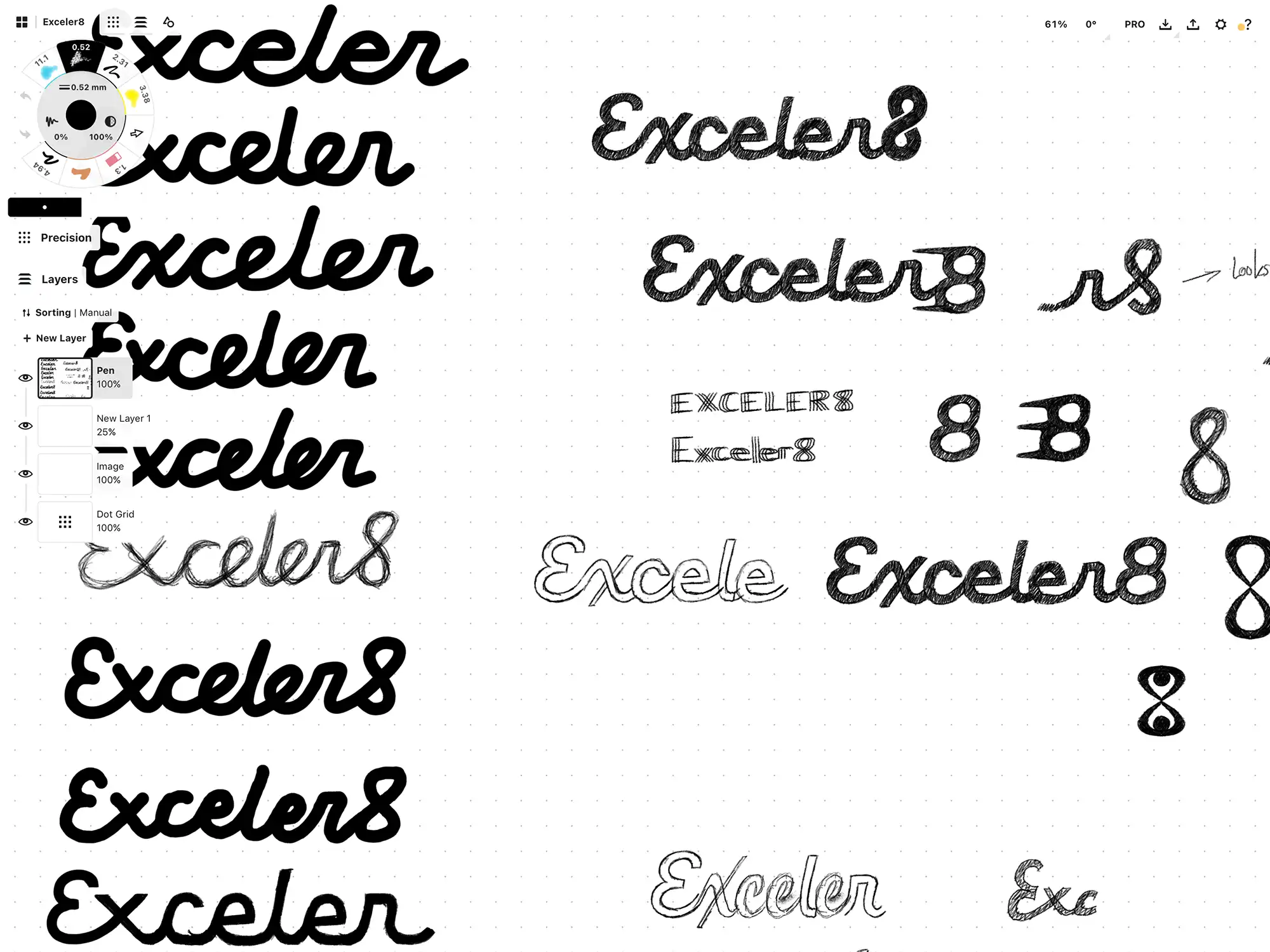
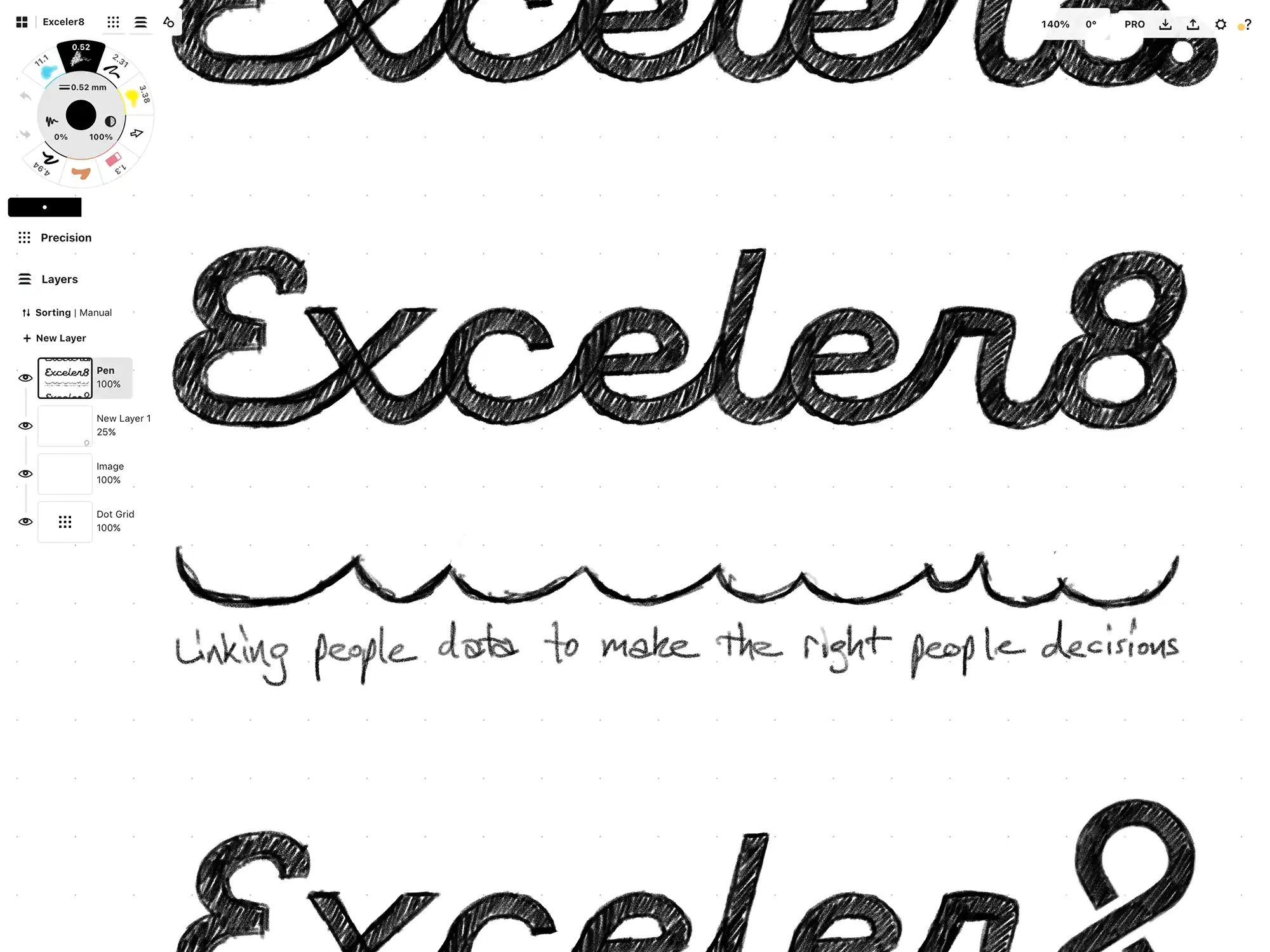
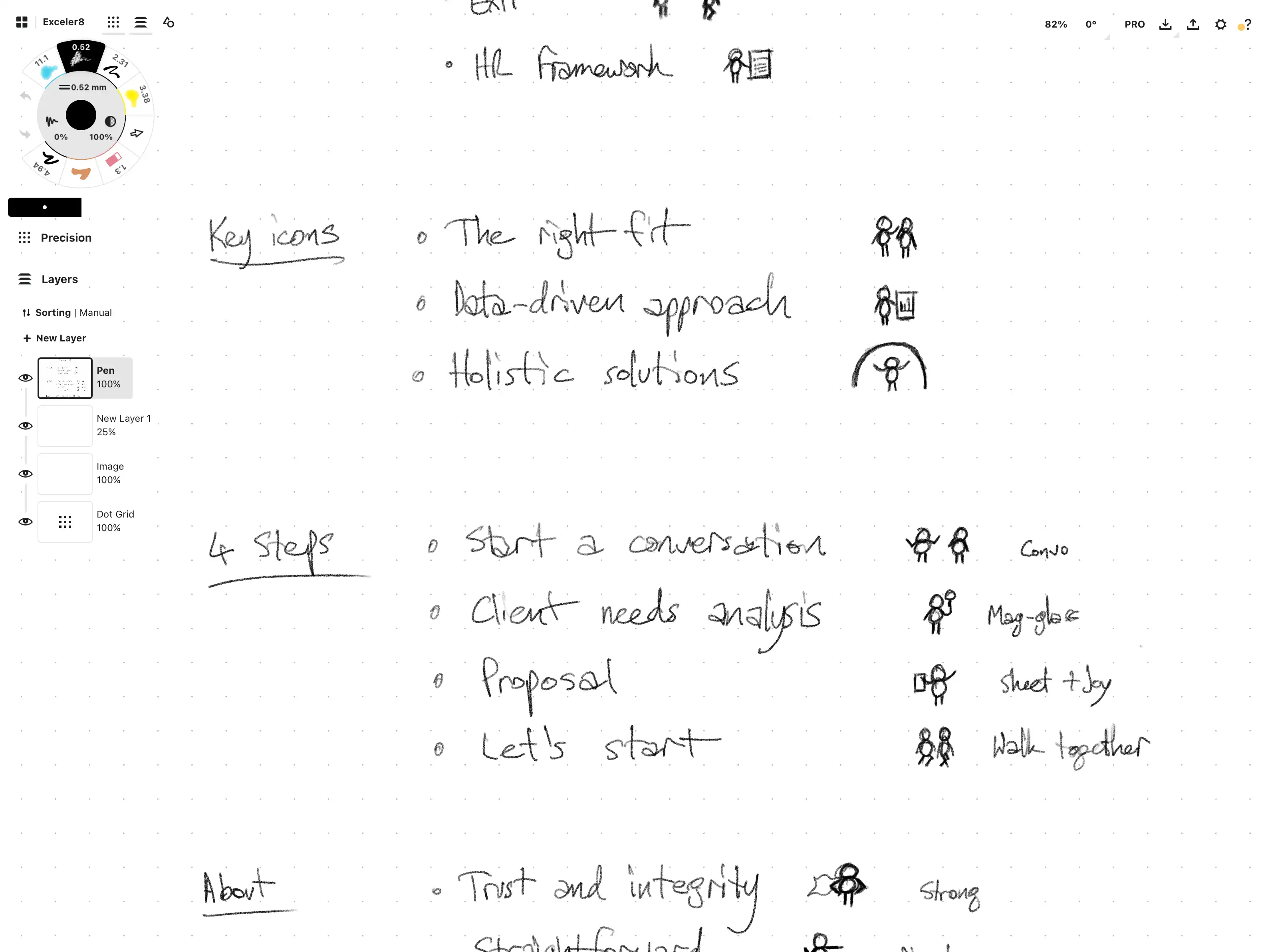
After gaining a collection of insights about the business, the process of sketching began, creating a vast array of variations and styles, before sketching out what would be very close to the final design.
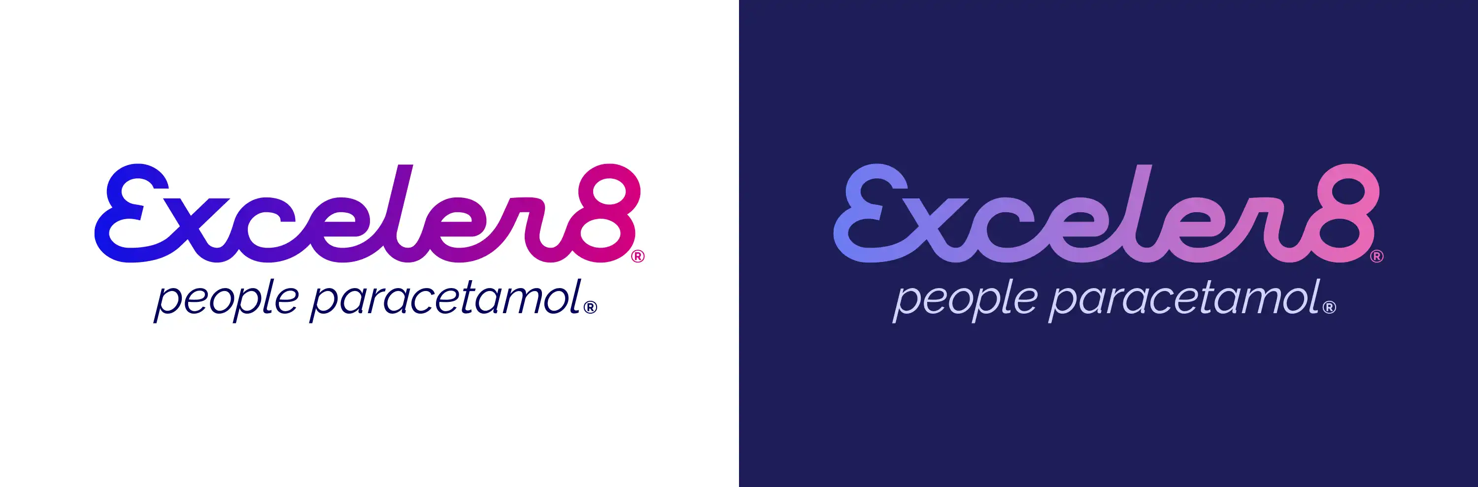
The new logo modernises and better structures the letter-forms to give it flow while still providing stability and trust. The slight lean forwards is a nod to clients and their businesses making progress towards having a better business without the people headaches. Part of the design rationale is the linking of letters, that represent the linking and understanding of people data, that gives businesses the confidence that they’re making the right people decisions.
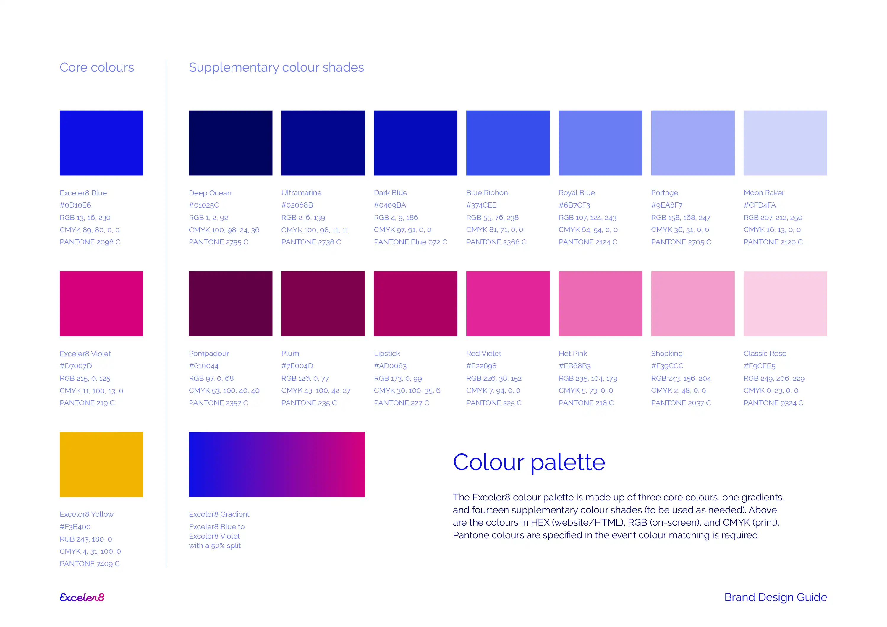
The colours from the existing brand have been translated to the new design, allowing brand equity from the past few years to be retained. In modernising the colours have gone from a two-colour logo and tagline, to a gradient filled logotype and a third darker blue for the updated tagline.
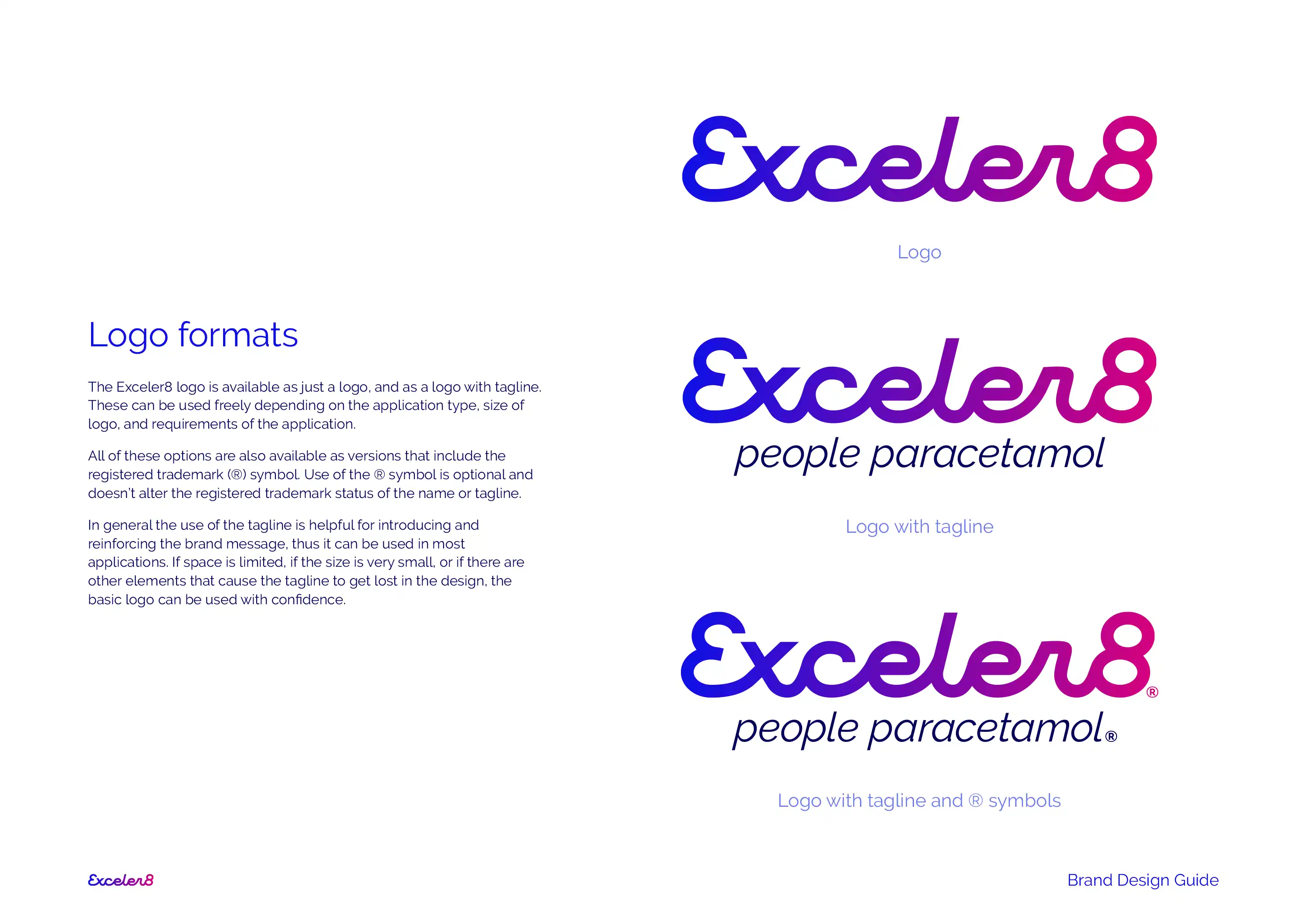
Melissa has been conscious not to have ‘HR’ in her business name, instead believes ‘fixing your HR headaches’ is more memorable, and has trademarked ‘people paracetamol’. This then was the obvious and appropriate new tagline for Exceler8 that can be used with and without the logo.
A range of logo formats and variations were created, with and without combinations of the tagline and ® registered trademark symbol. The two existing core colours were specced and expanded on to create a range of tones for the brand identity. The Exceler8 Yellow was also retained as a sparingly used highlight colour.
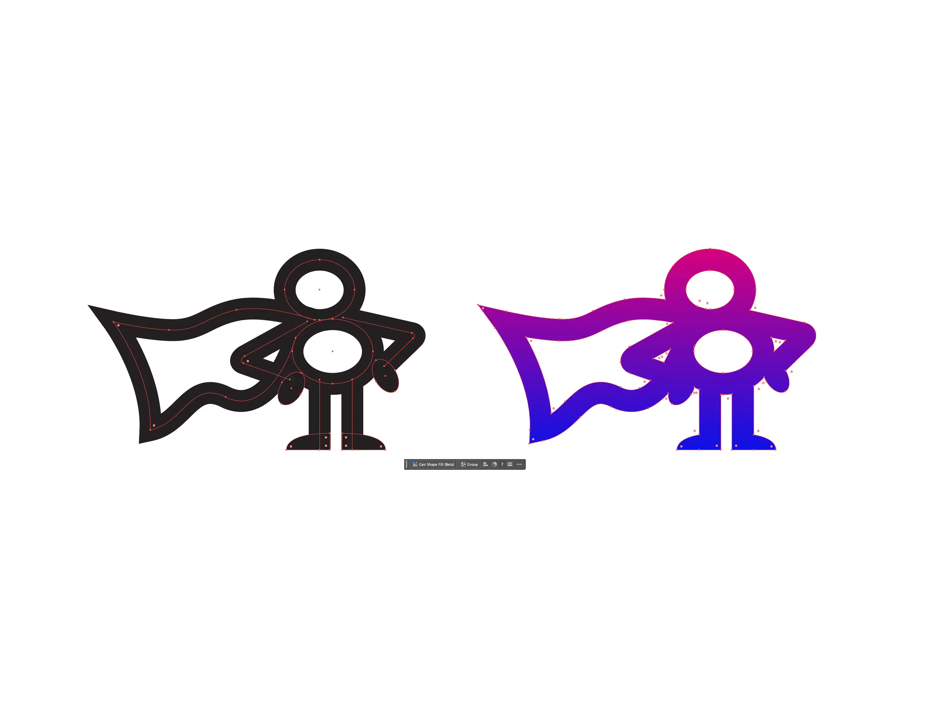
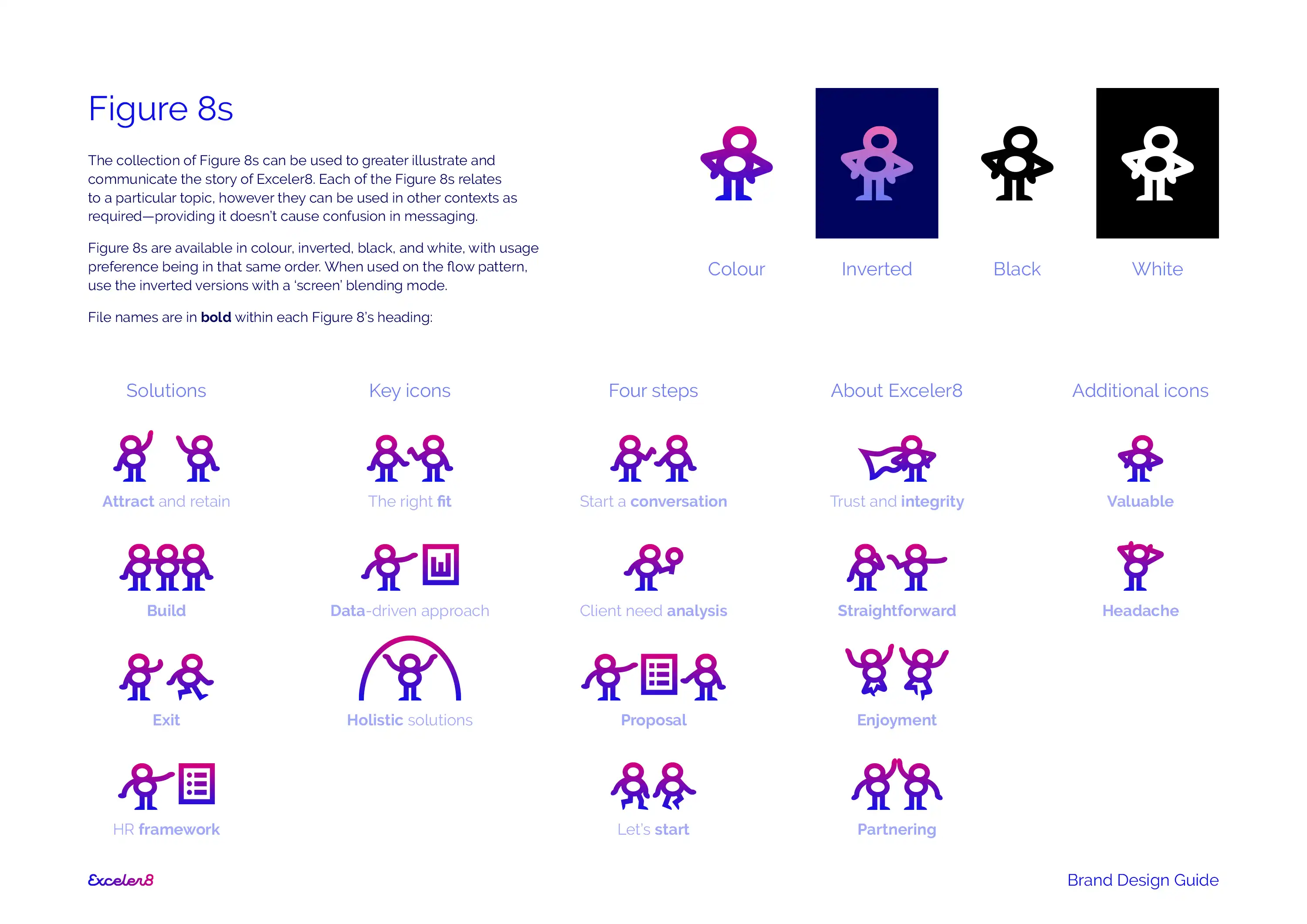
Moving on from the existing abstract icons, we worked to produce a range of people icons that told the story of the brand and business. During this process we noticed that the quick stick figure sketches looked a bit like the newly created '8' from the logo. This sparked the creation of the Exceler8 'Figure 8s'!
This super-fun collection of Figure 8s can be used to greater illustrate and communicate the story of Exceler8. Each of the Figure 8s relates to a particular topic, and they can also be used in other contexts as required.
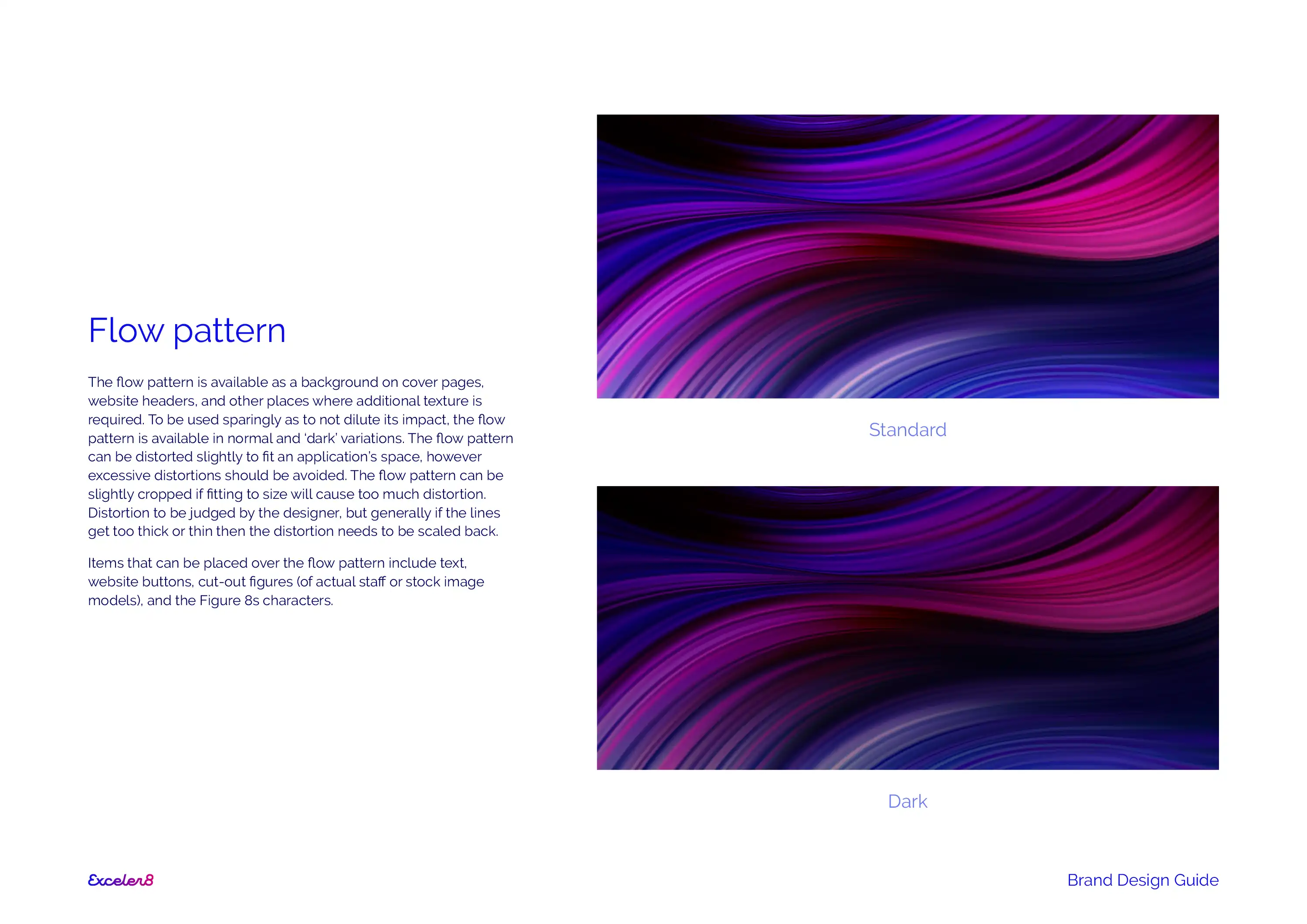
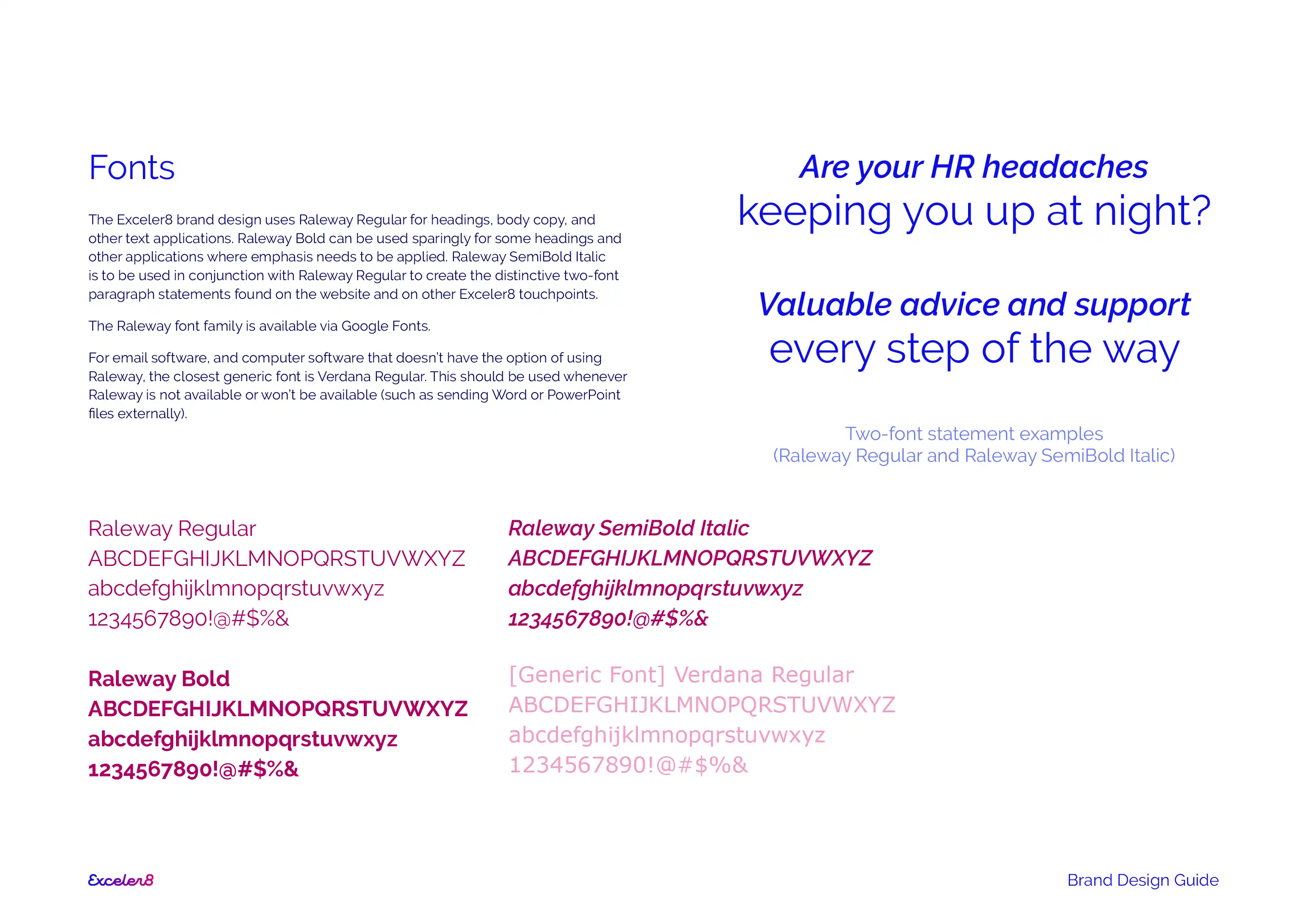
Once the Figure 8s were created, we looked at the rest of the brand identity. This included producing the flow pattern to add movement and texture to the otherwise flat colours, and specifying the use of fonts throughout the brand.
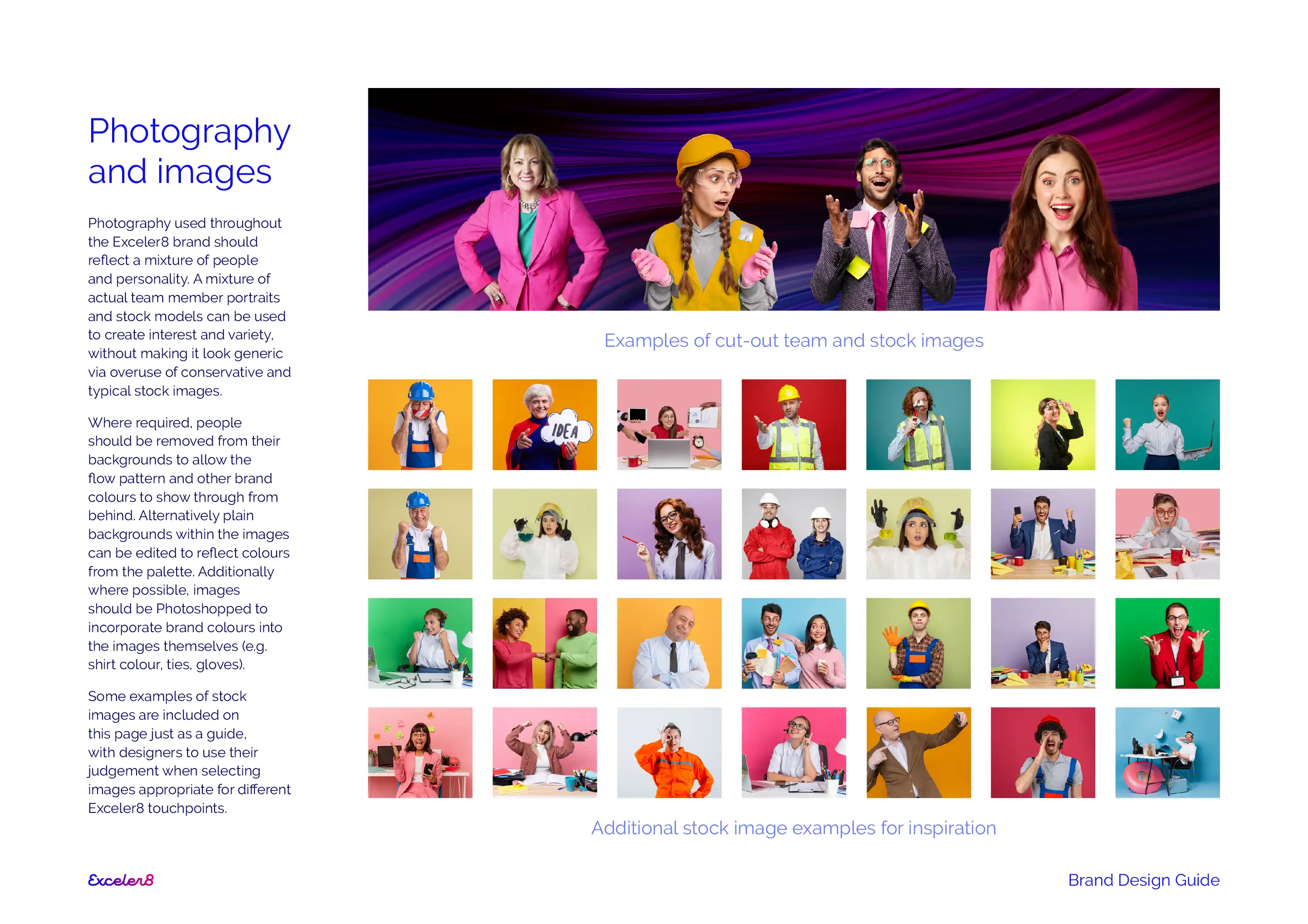
Melissa already had a range of images featuring herself from a professional photoshoot, so we looked at ways of expanding the image library beyond just herself while still retaining the colourful and quirky style of her existing photos.
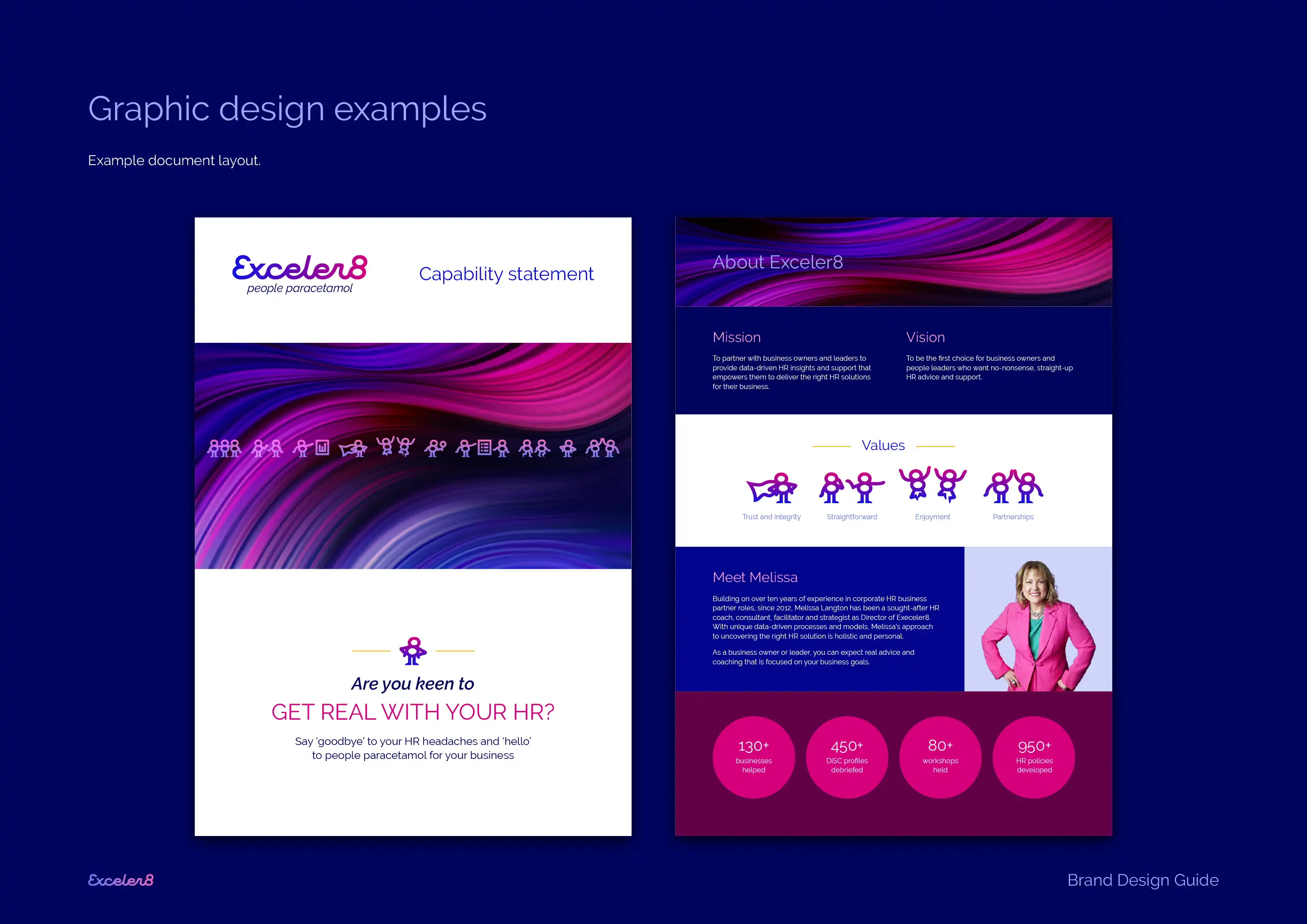
We then created a range of graphic design examples and mock-ups, including document layouts and a business card design.
Exceler8 already had an existing and on-going relationship with their copywriter and website designer. As such we created design mock-ups of the website which were then handed over to the existing supplier to update the design. Care was taken through this process to ensure the brand identity was fully realised while still retaining the core structure and layout of the existing website—ensuring the website component was a refresh rather than a rebuild.
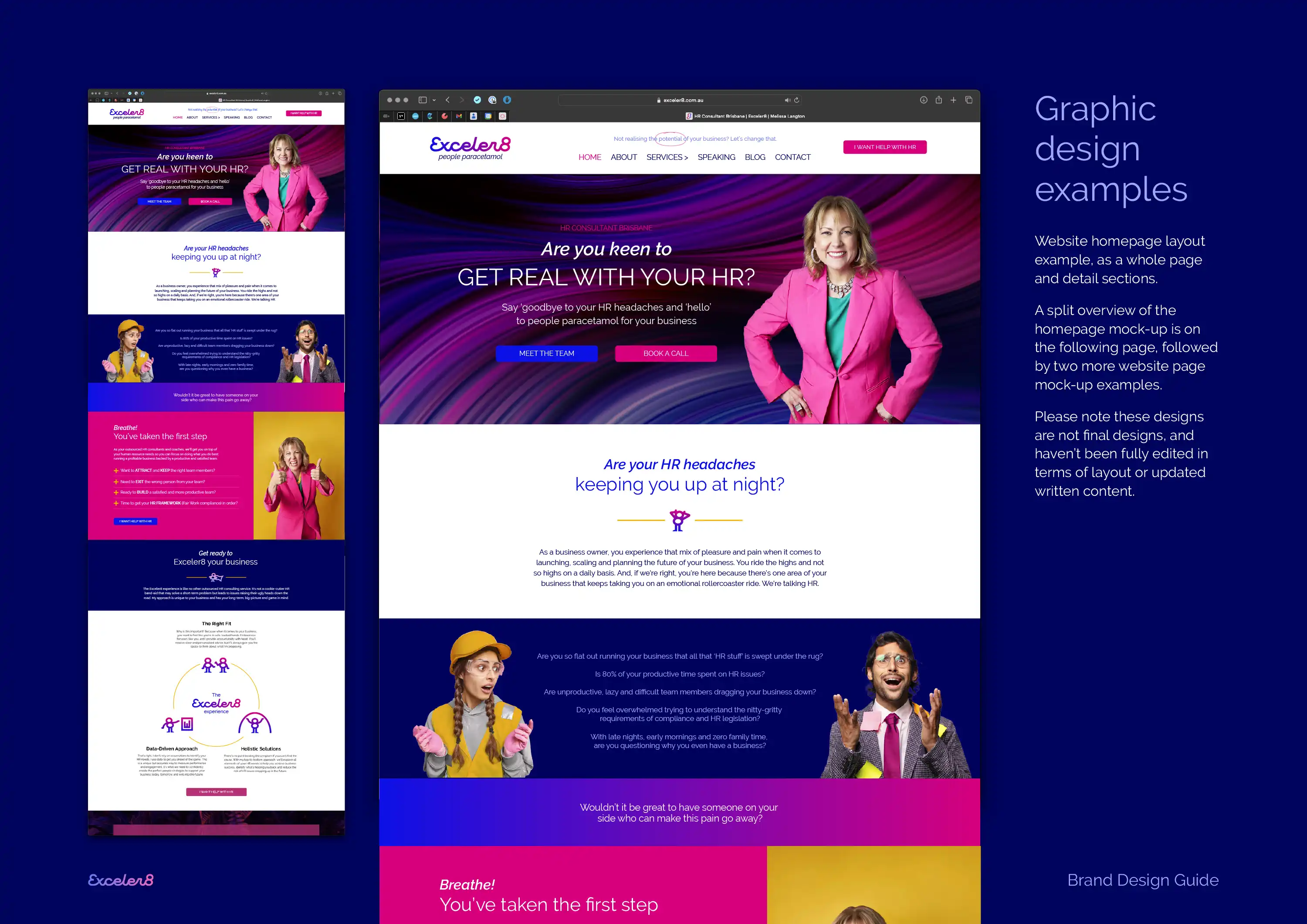
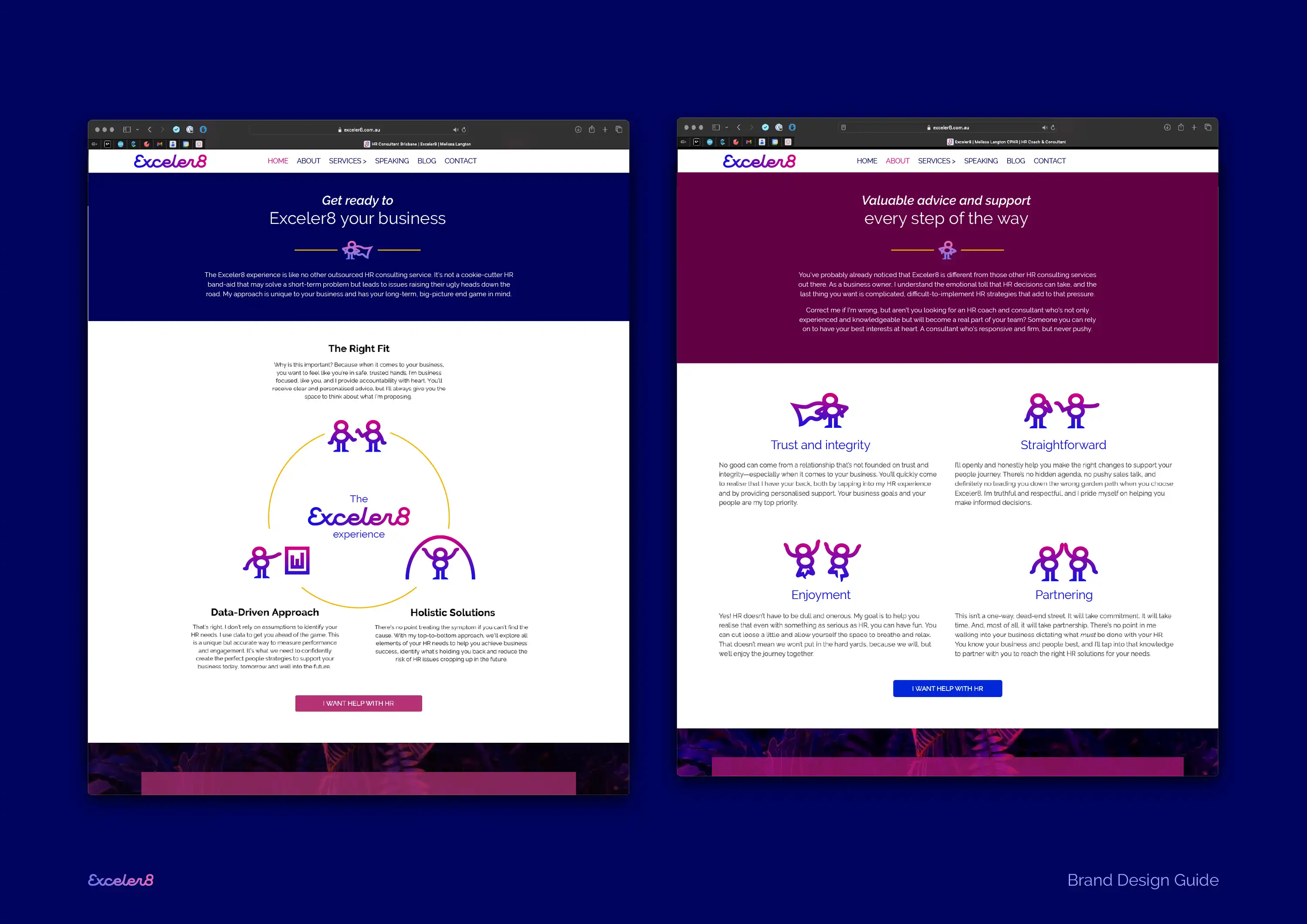
The Exceler8 brand design has positioned Melissa's business as ready for the future expansion plans, while still retaining the authenticity that the old brand conveyed so well. The Figure 8s are a stand-out feature of this brand design project, successfully conveying Exceler8's solutions, key benefits-to-customer, the four-step process, and company values—all the while reinforcing the brand identity's colour gradient and the all-important '8'!
Melissa kindly gave us this five-star Google Review:
'I've been through brand design before and it was a great experience but it paled into insignificance to Evocative's process. They were able to get to the core of our business brand essence and pulling that into a 'vibe' that can be translated into the many pieces of collateral is a true asset. Most importantly though, it's a brand that supports our future state and goals and will be relevant for years to come. To release the brand out into the wild was exhilarating and the fun starts in developing more visual assets for our business to talk to our market.'
You can follow Exceler8 on Facebook, Instagram, and LinkedIn, and you can visit the Exceler8 website here: exceler8.com.au
In this Inspired by Evocative, Ben showcases how the figure-8 icons were created as part of the Exceler8 HR brand design project. Rather than using generic icons, these figure-8s help tell the brand story while strengthening the brand design in every touchpoint.