Brisbane Bushcare
logo design | brand identity | illustration | website
In operation for over a decade, Brisbane Bushcare has earned a reputation for its high quality of service and on-the-ground work in the land and conservation management industry. The Brisbane Bushcare team provide environmental and restoration services to a wide variety of clients in the greater Brisbane area, including Brisbane City Council, the University of Queensland, Healthy Land and Water, Land for Wildlife, and Catchment Groups. All of their work is planned and delivered within the framework of ISO certified Quality, Safety and Environmental Management systems.
 While
the in-the-field reputation for ecological restoration was second-to-none, Brisbane Bushcare's brand precence was something that needed
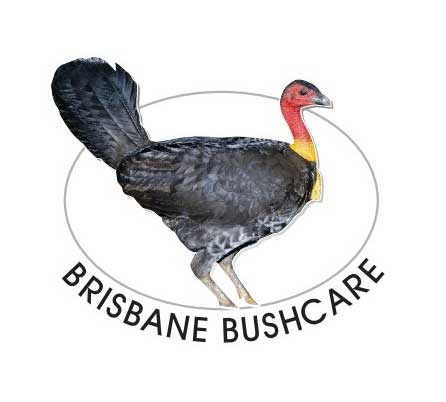
its own dose of rehabilitation. Starting with nothing more than a lonely landing page, and a brush turkey logo—that often confused locals
into thinking they were arriving to GET RID OF the brush turkeys—Evocative started working with owners Javier and Alice to create a logo
and brand design worthy of their passion for the environment.
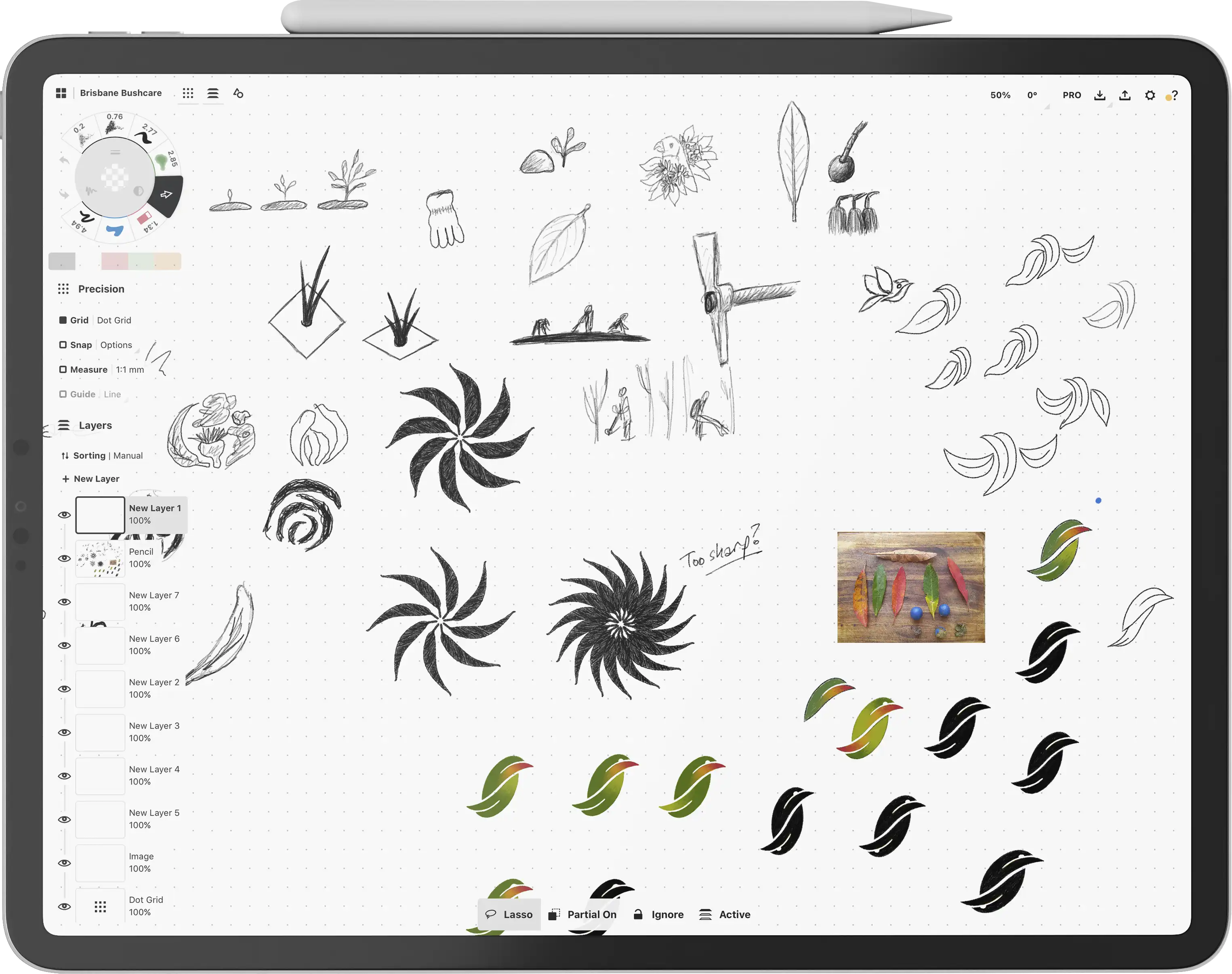
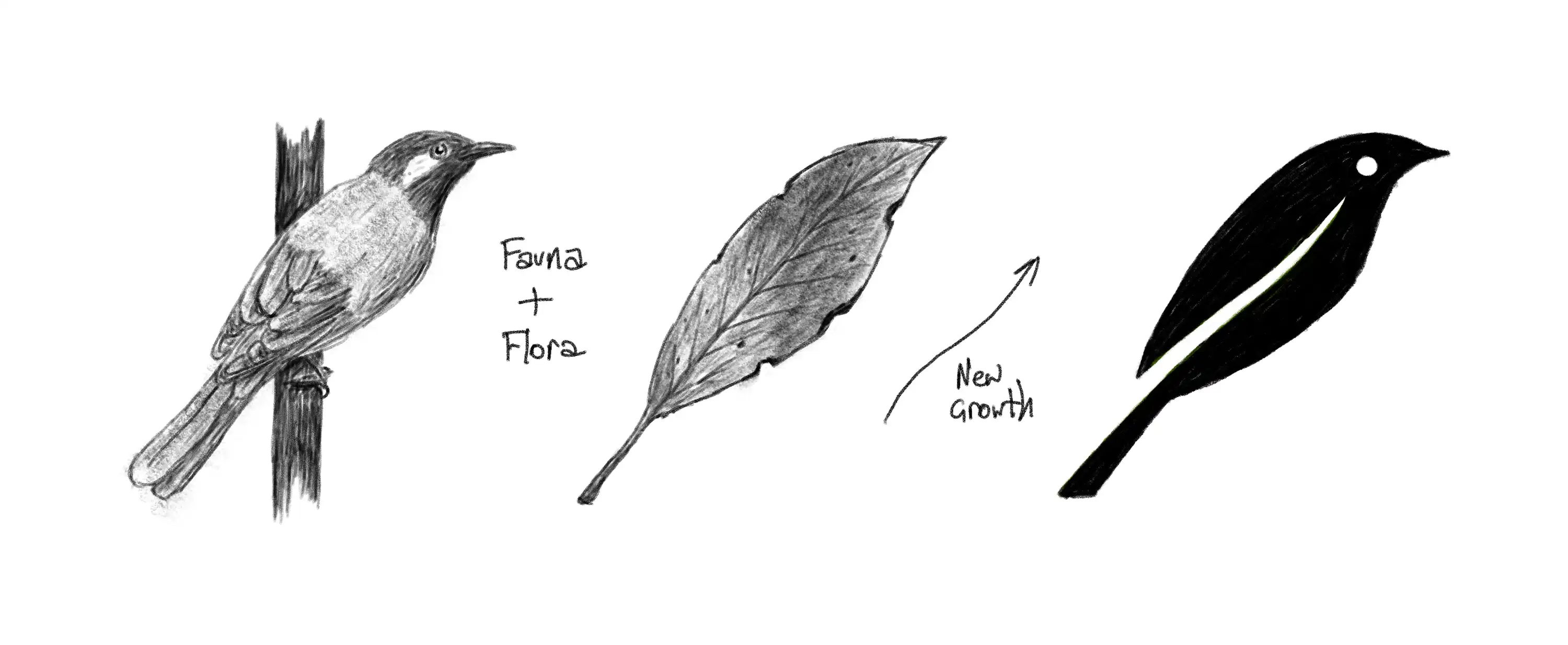
After gaining a collection of insights about the business, the process of ideation and sketching began. At the very beginning we looked at everything from organic elements to the actual tools of the trade such as mattocks and gloves. Through this process we leaned into the natural shapes being more important and meaningful than the process of tending to the bushland, thus the exploration of various leaf patterns. Arranging leaves into geometric patterns proved to be sharp and saw-like, so we started looking at the idea of combining and leaf with a bird shape ... telling the story of both flora and fauna.
Through this process we moved through options that included two leaves, instead settling on a more elegant solution of a single leaf that could also be seen as a bird. Some of the sketches were looking a little penguin-like, but the shift of the negative space split from below the tail feather to above the tail feather created a shape more like a bushland bird.
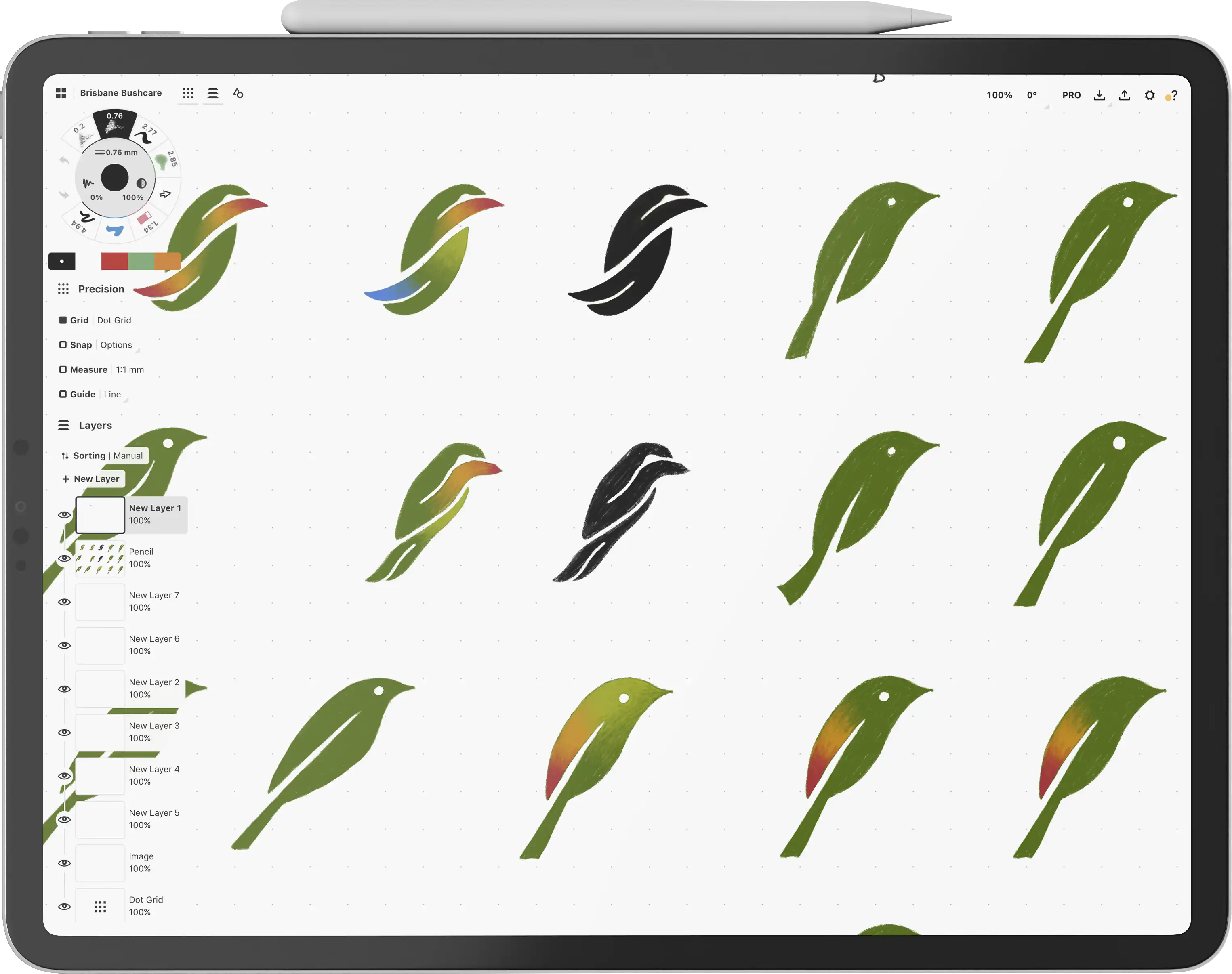
During some further research we found the White Eared Honeyeater which is native to various areas of Australia including South-east Queensland. This honeyeater also prefers environments that feature a eucalyptus canopy, rough bark trees, and a shrub layer below. The logomark concept was then further refined to better reflect the shape of the honeyeater.
The stylised design of the logomark represents both fauna and flora, and also new growth with its forward-facing direction.
The logomark was then refined from a sketch into a perfectly crafted vector shape. A logotype was then created by customising a font that featured both straight and curved edges, helping to represent the structured and trustworthy nature of the business while integrated the company's intrinsic passion for nature and wildlife.
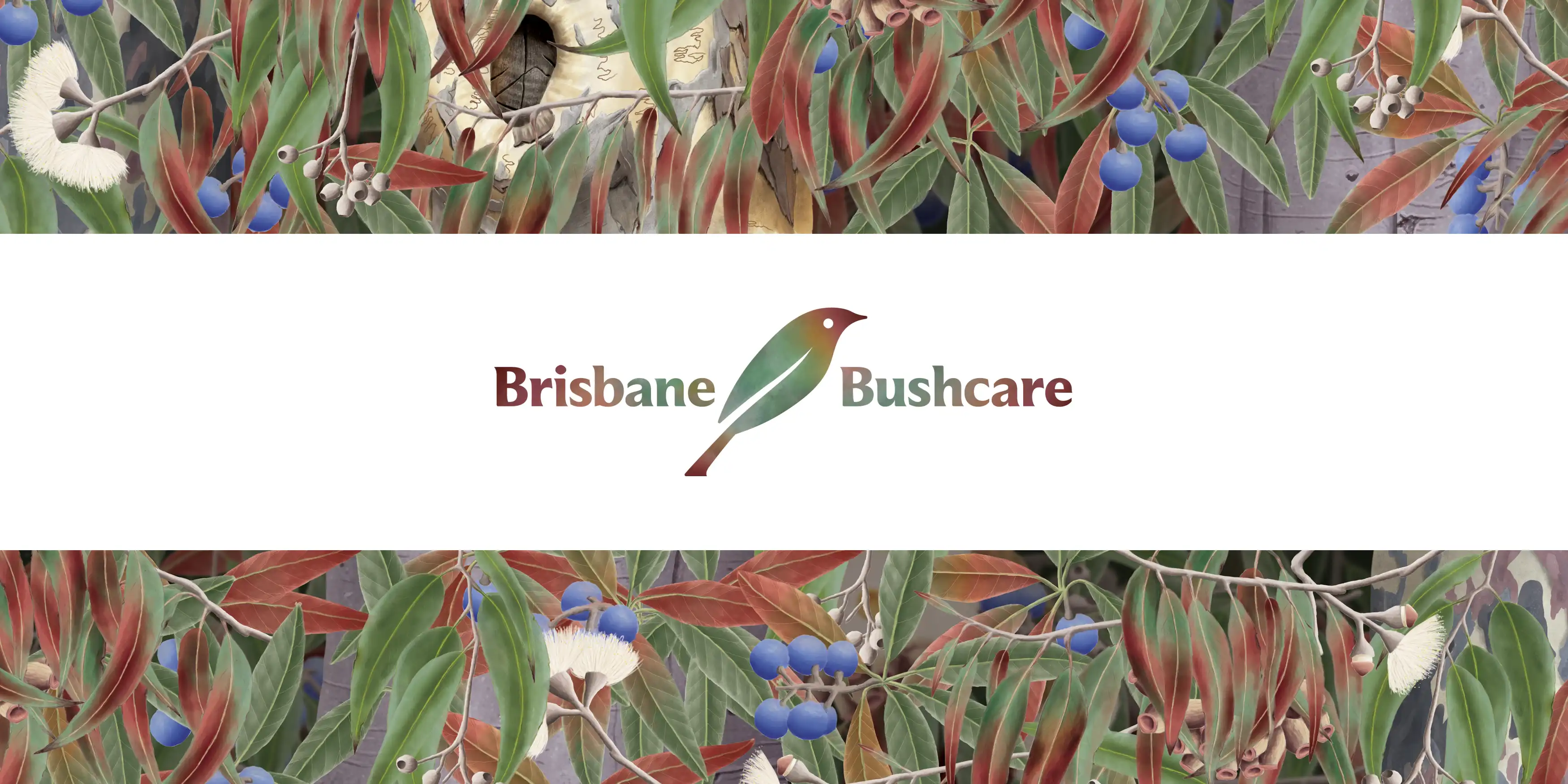
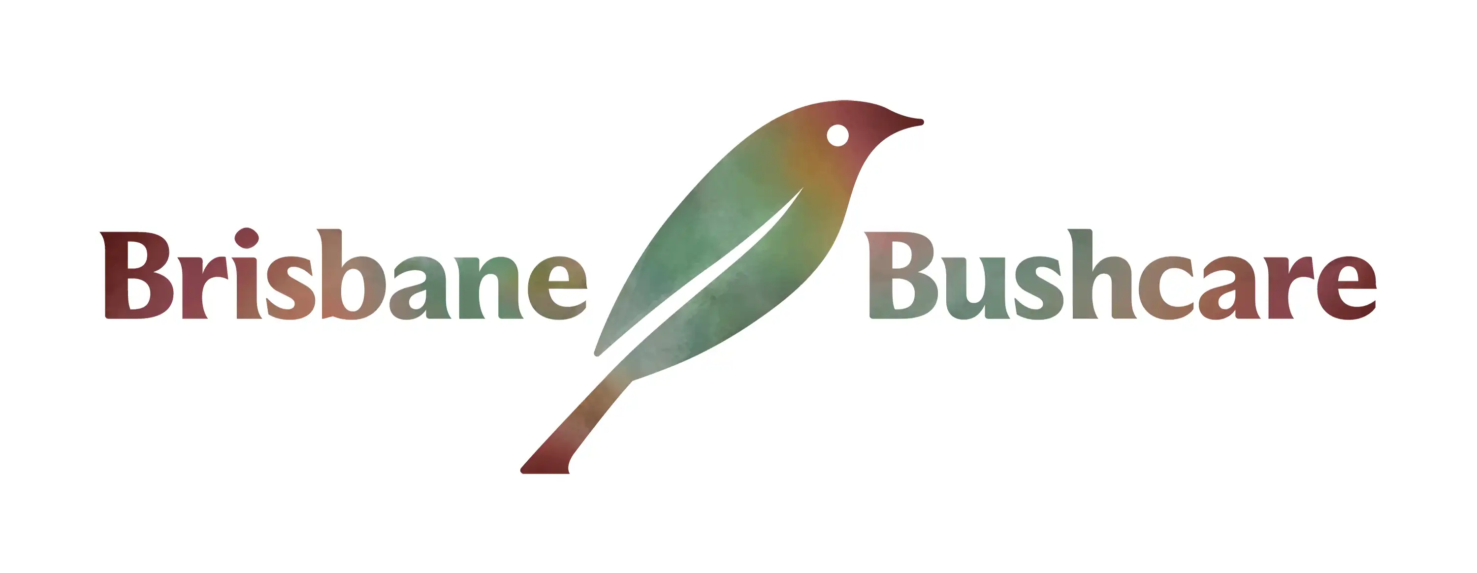
The logotype was positioned with the logomark in the middle, forming the final logo design. The next stage of the project was the illustrations, so the colours and texture of the logo were reserved til after the illustration work was completed.

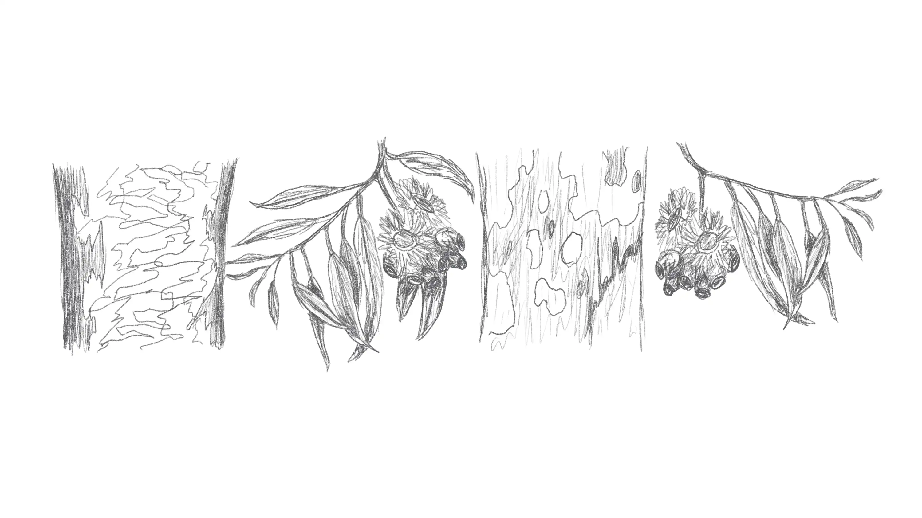
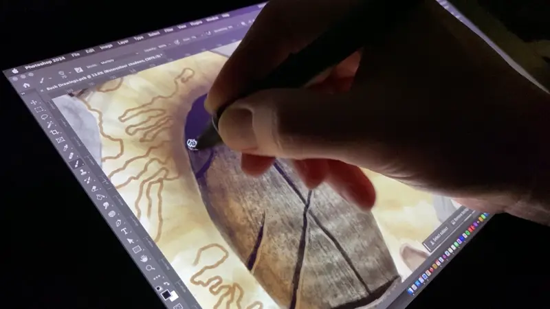
Beginning with a range of digital pencil sketches, the themes and elements of the illustrations were worked out. We then experimented with a range of Photoshop watercolour brushes using the Wacom pen and screen.
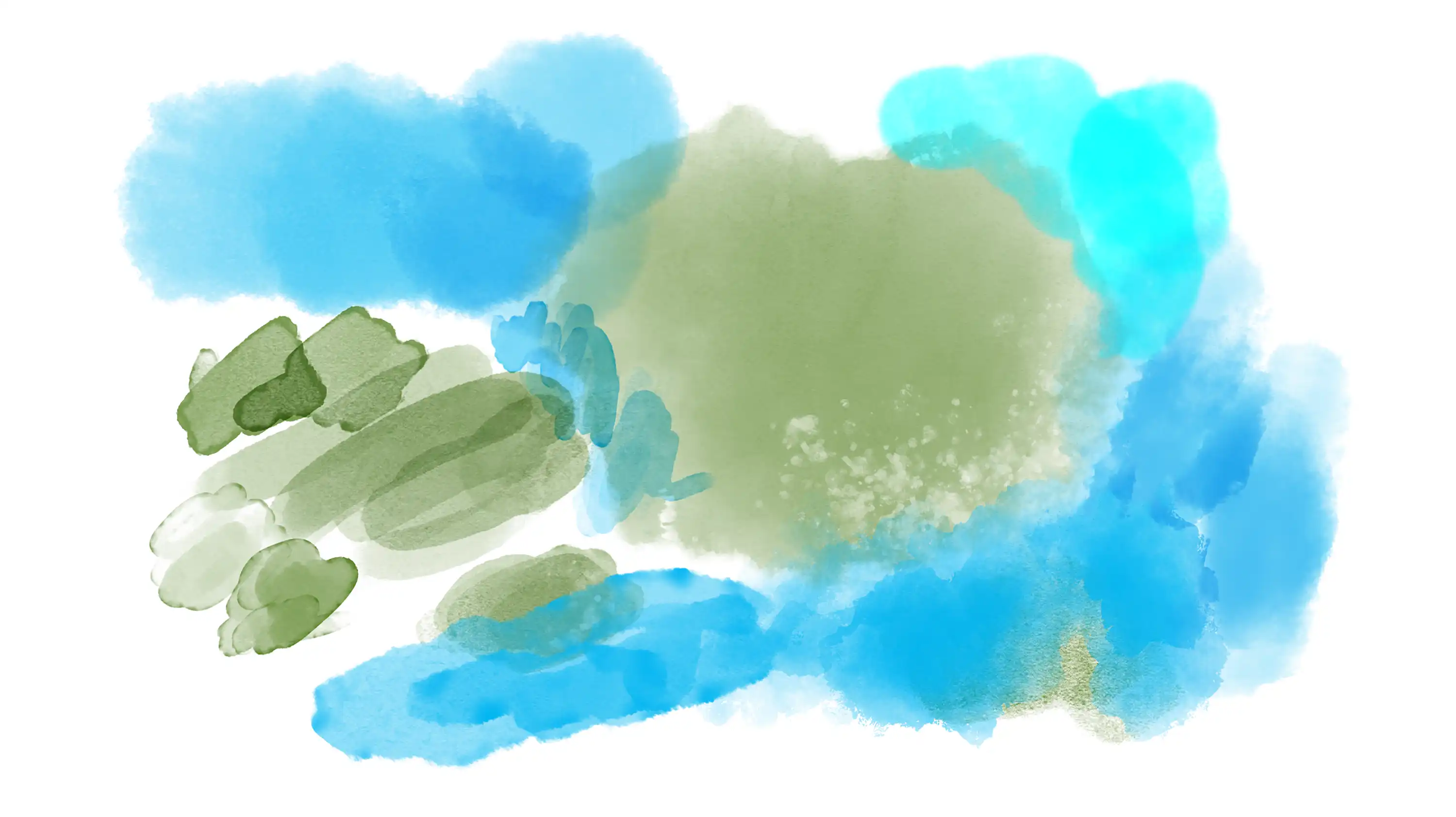
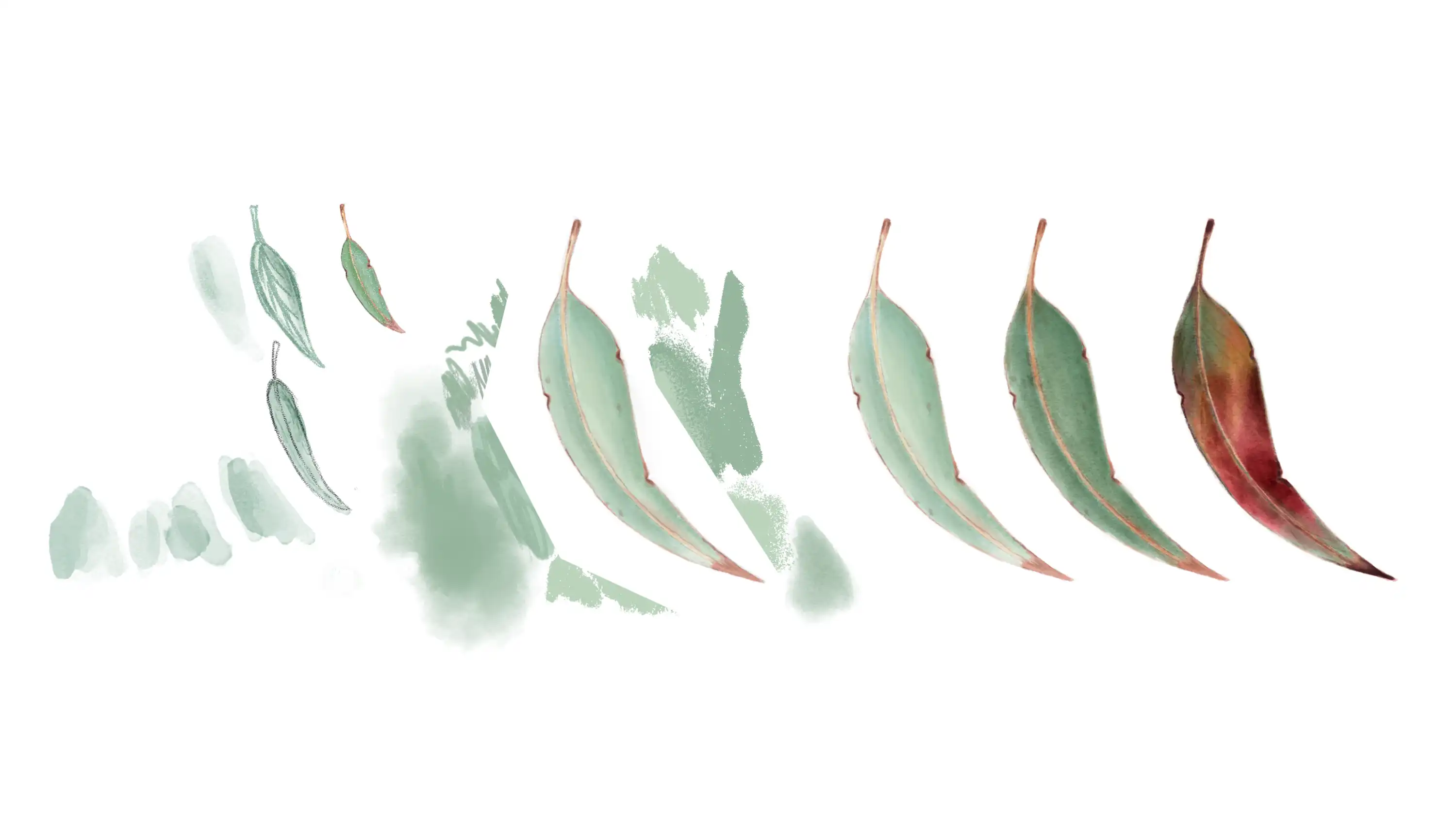
Once the watercolour brushes and textures were decided on, the process of creating the look and feel for the illustrations began. We started with just a single leaf, gradually adding more and more texture, and eventually bringing in more burnt and earthy colours to help get away from the typical bushcare 'green and brown' designs.
With the style set, we then started creating a range of leaves, cherries, gum blossoms, gum nuts, and tree trunks that would eventually be combined in different ways to generate a range of brand design assets.
The bushcare illustrations were combined into a long pattern that seamlessly repeats along the horizontal axis, meaning the pattern can be made a short or as long as any application requires. In addition to the pattern, a collection of over a dozen individual illustrations were created; to be used as accents and interest points across various touchpoints such as report documents and the website.
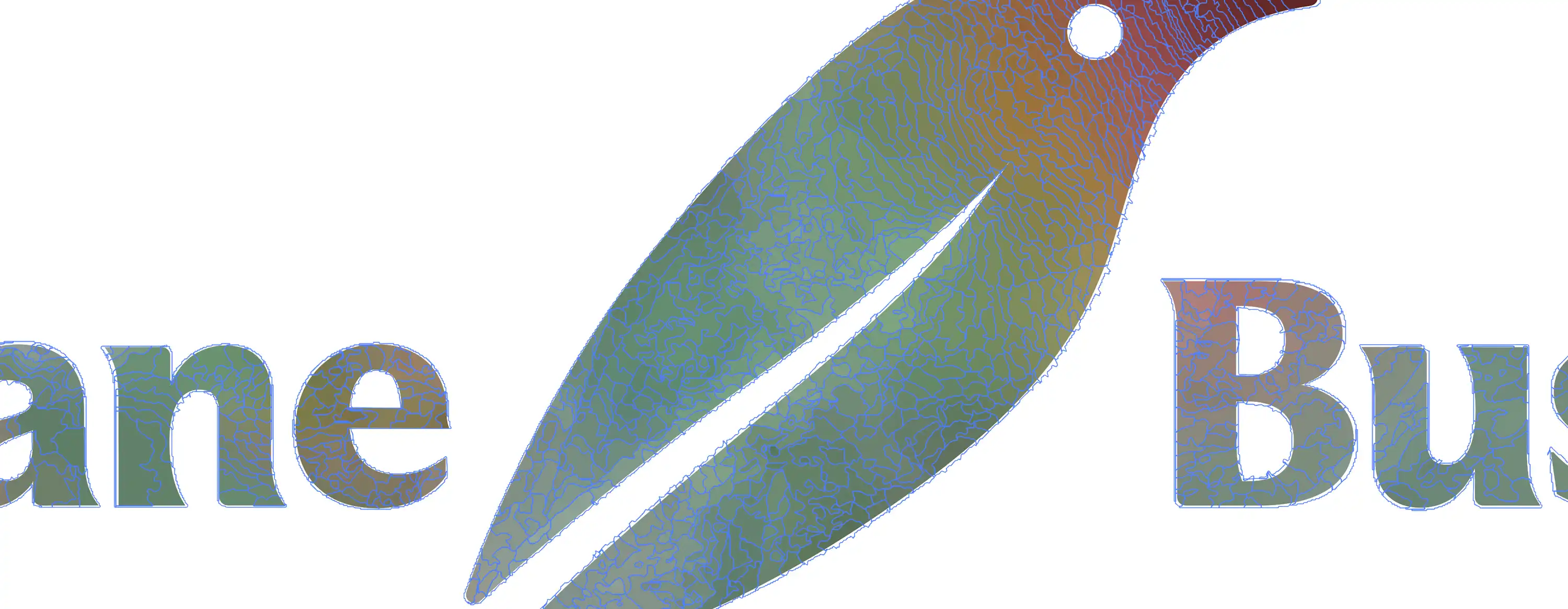
The colours and textures from the illustrations were then taken and refined, and placed over the logo shape that had been previously created. This texture was then vectorised to make it scalable, and an inverted version was additionally created for the rare occasion the logo needed to be placed on a dark background.


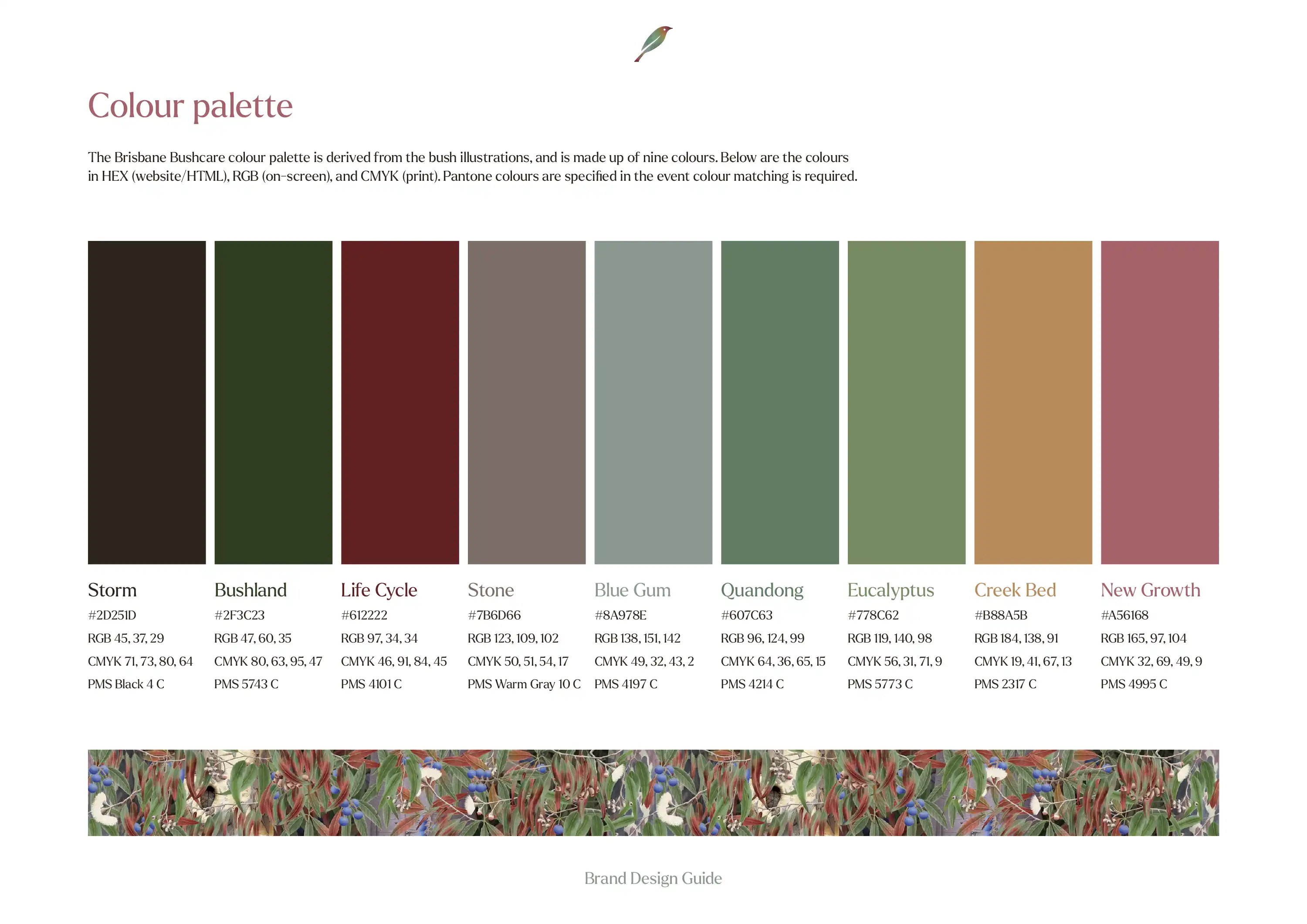
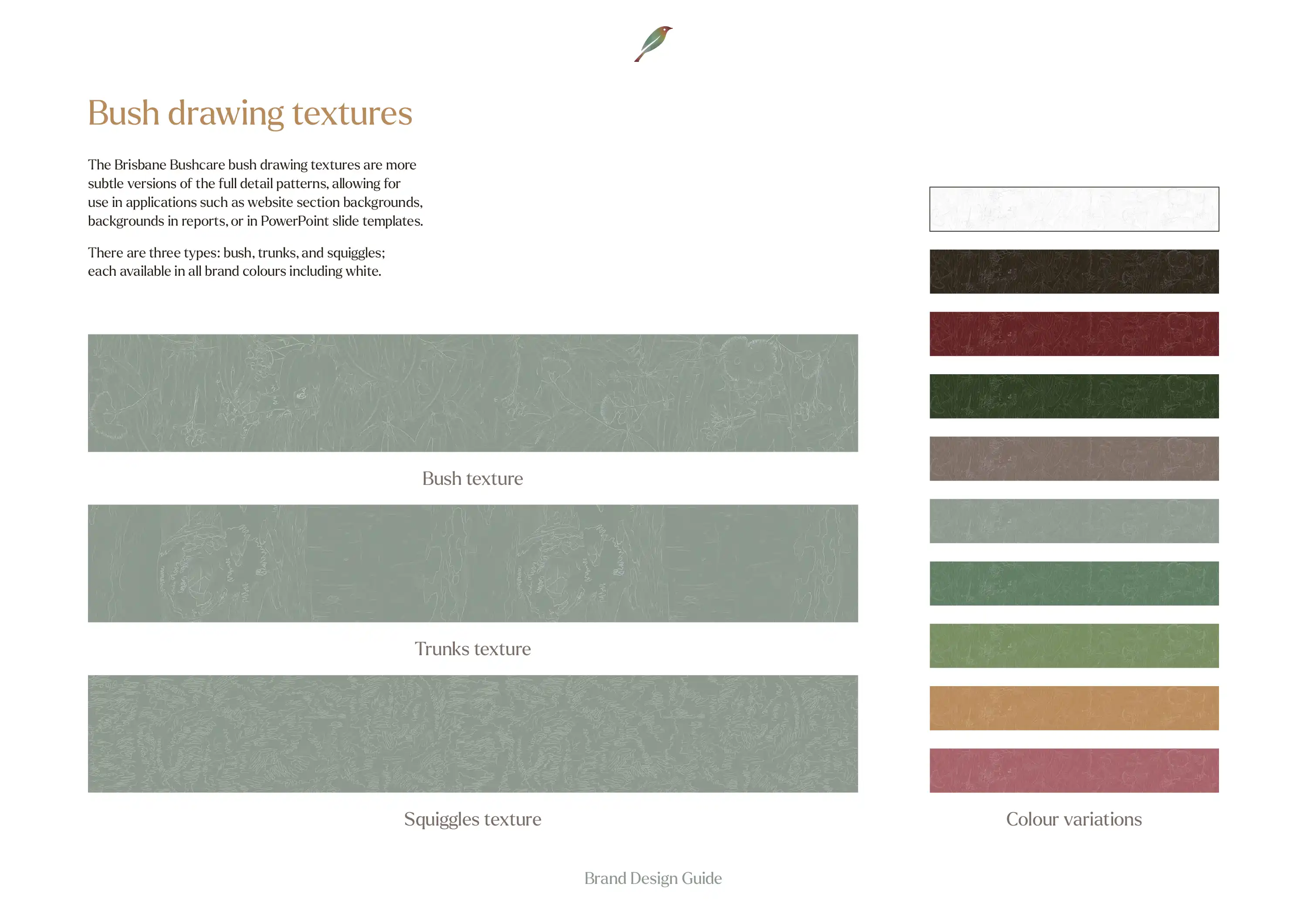
The rest of the brand identity was then created which included a custom colour palette that was informed by the illustrations and logo design. We also created some additional 'bush drawing textures' using existing and new illustrations, which are able to be used as backgrounds in reports, PowerPoint presentations, and on the website.
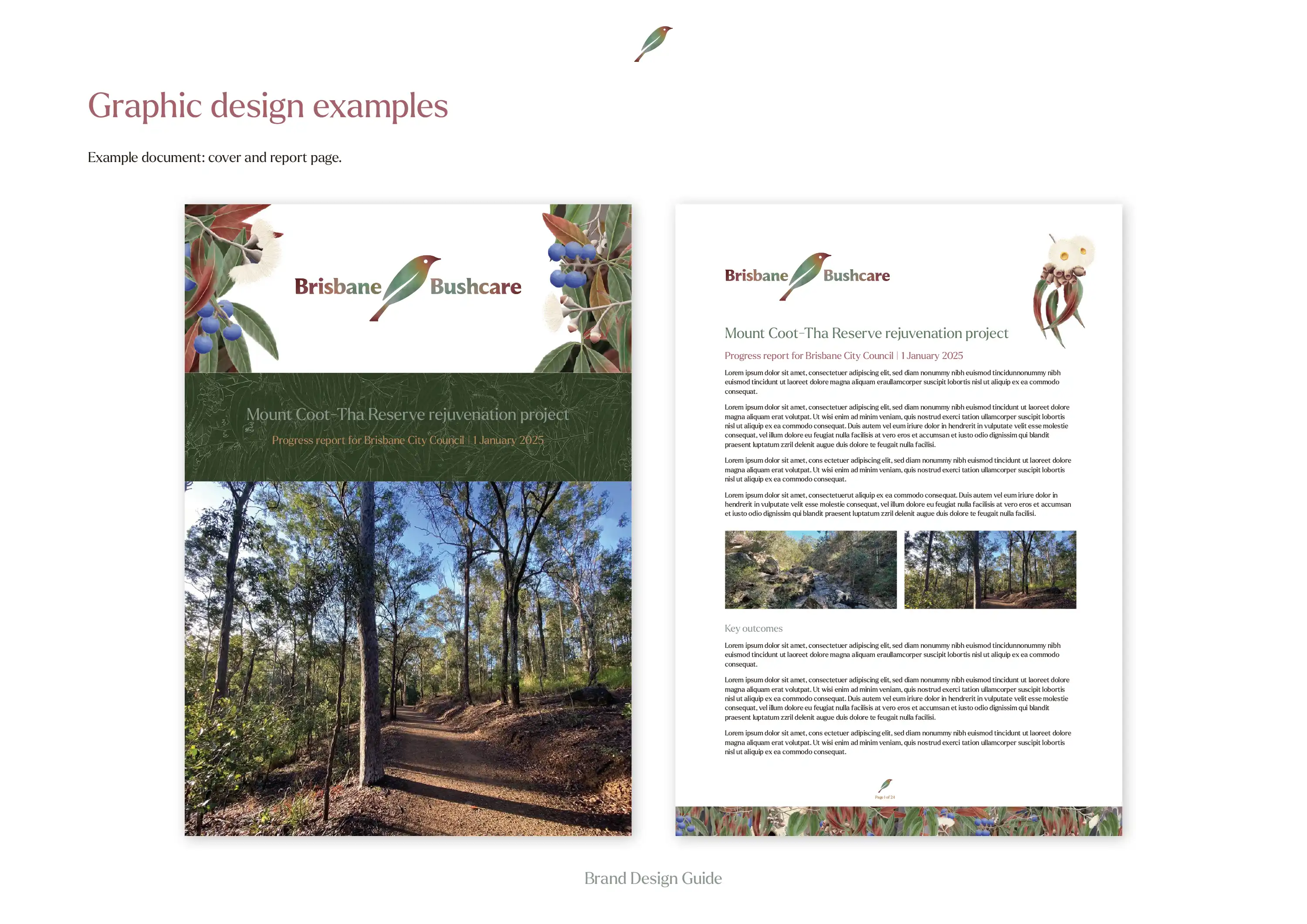
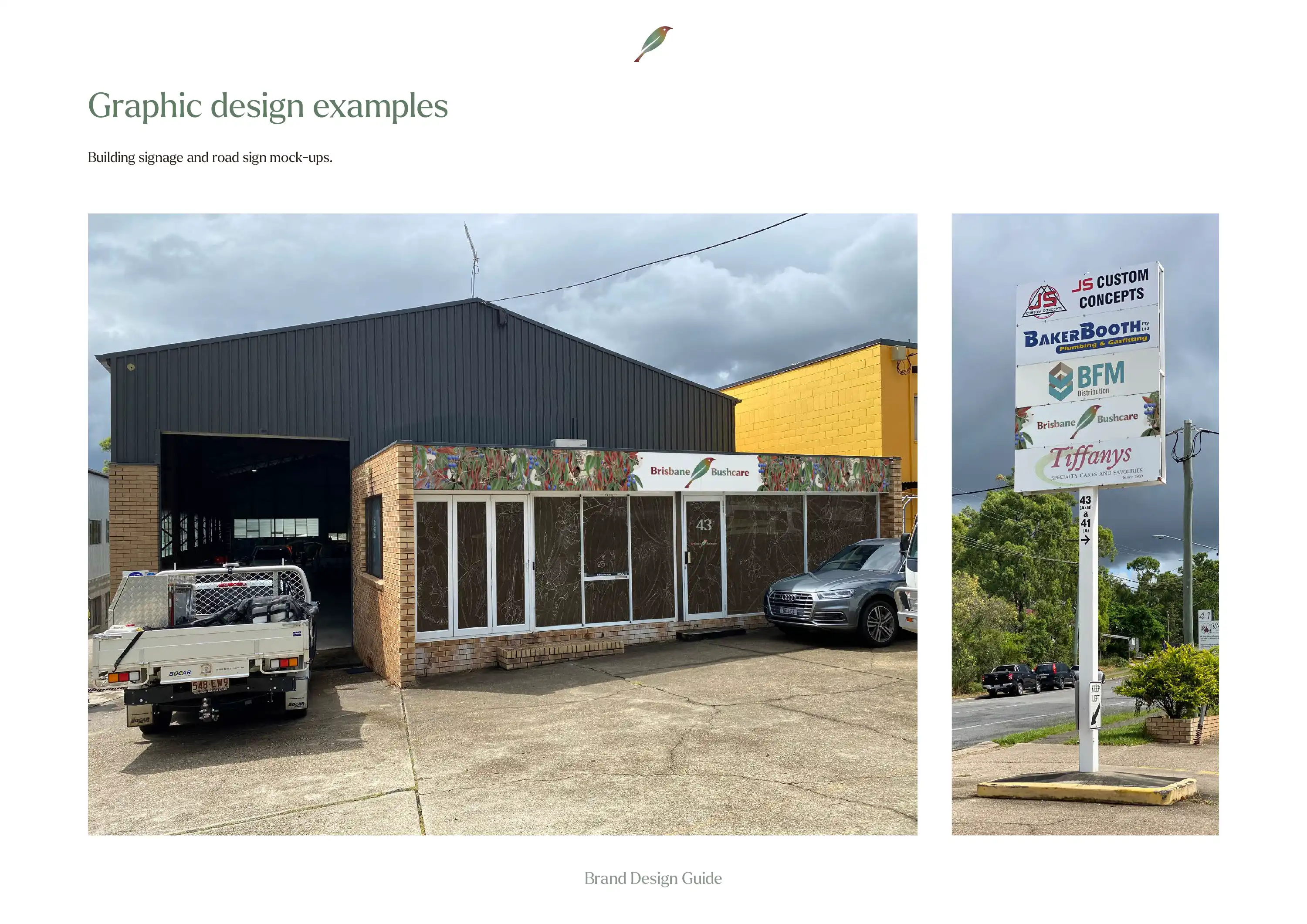
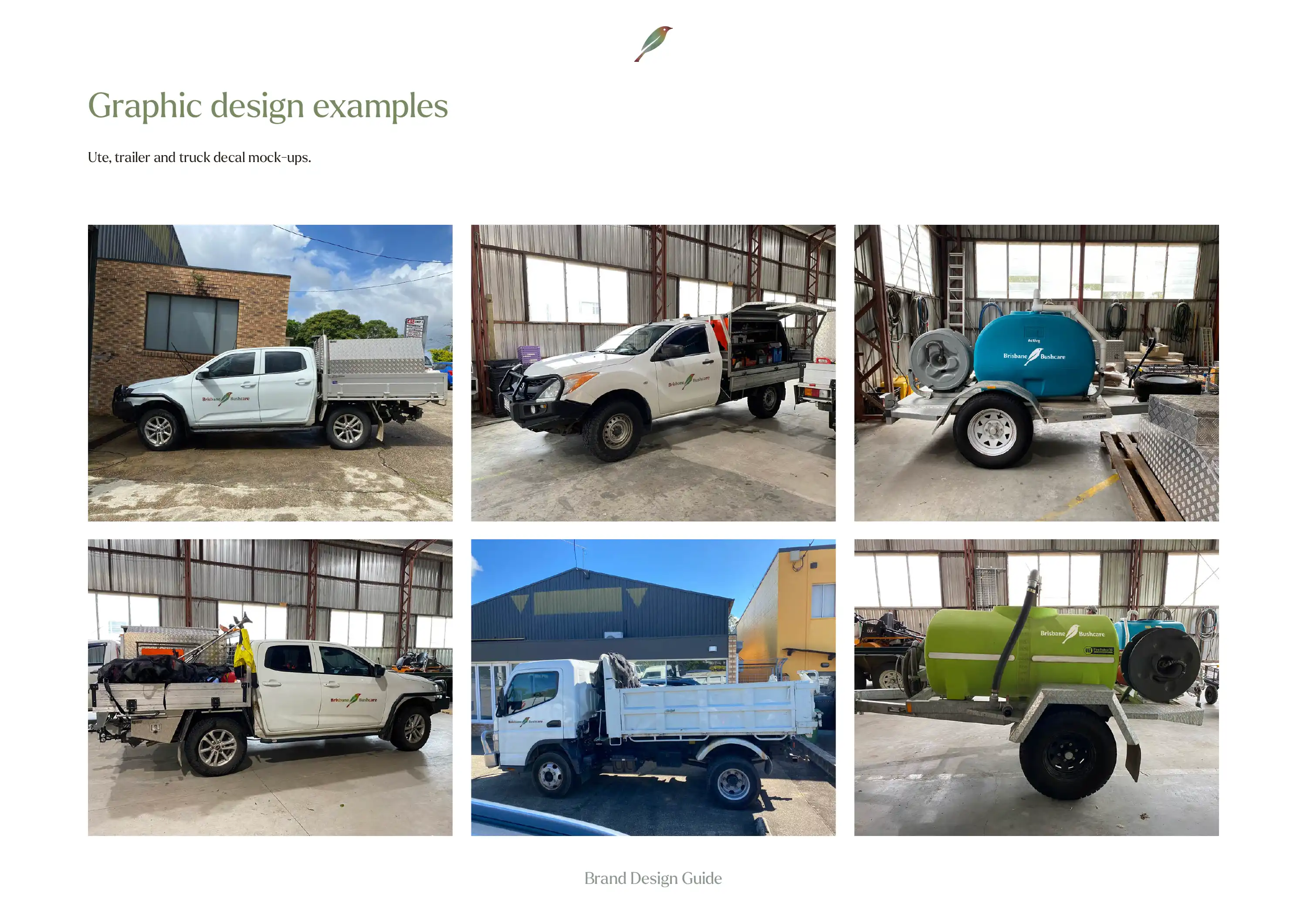
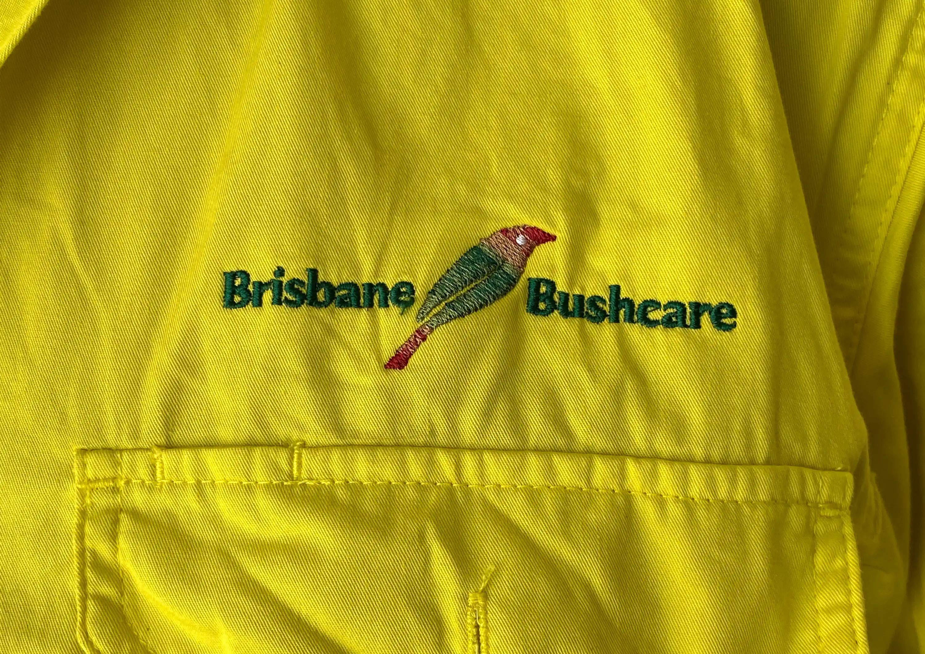
A range of application mock-ups were created to show the brand design working in documents, on external signage, on vehicles and trailers, and on the team uniforms. The final design for the embroidered uniforms was a simplified colour version that still conveys the brand equity while being feasible to produce.
The brand design was then translated into a website that we designed and build on the Oncord platform. Making full use of the illustrations, patterns, and a collection of client-supplied and stock images, the new website tells the story of Brisbane Bushcare through visuals as much as it does through the messaging.
You can visit the Brisbane Bushcare website here: brisbanebushcare.com.au

The end result from the brand design process was a unique and meaningful visual identity system that reflects Brisbane Bushcare's professional reputation and undeniable passion for the natural environment, which is especially important when working with clients like Brisbane City Council.

In this Inspired by Evocative, Ben describes the design process behind creating the Brisbane Bushcare logo. The design combines a white-eared honeyeater with a leaf shape, and uses a watercolour texture to match with the rest of the brand identity design.

