Bean Brewding
logo design | brand identity | graphic design | photography | website
Bean Brewding was established in 2010 when a trio of workmates started exploring West End coffee shops as an escape from the office. They quickly realised that there was an ever-increasing number of amazing local cafés, coffee shops and roasterys across Brisbane and beyond that were only too happy to share their passion for coffee. So they decided to start a blog that promoted the Brisbane coffee scene and its quality and quirky establishments–which then turned into running regular ‘Brisbane Coffee Tours’ around the city and local suburbs.
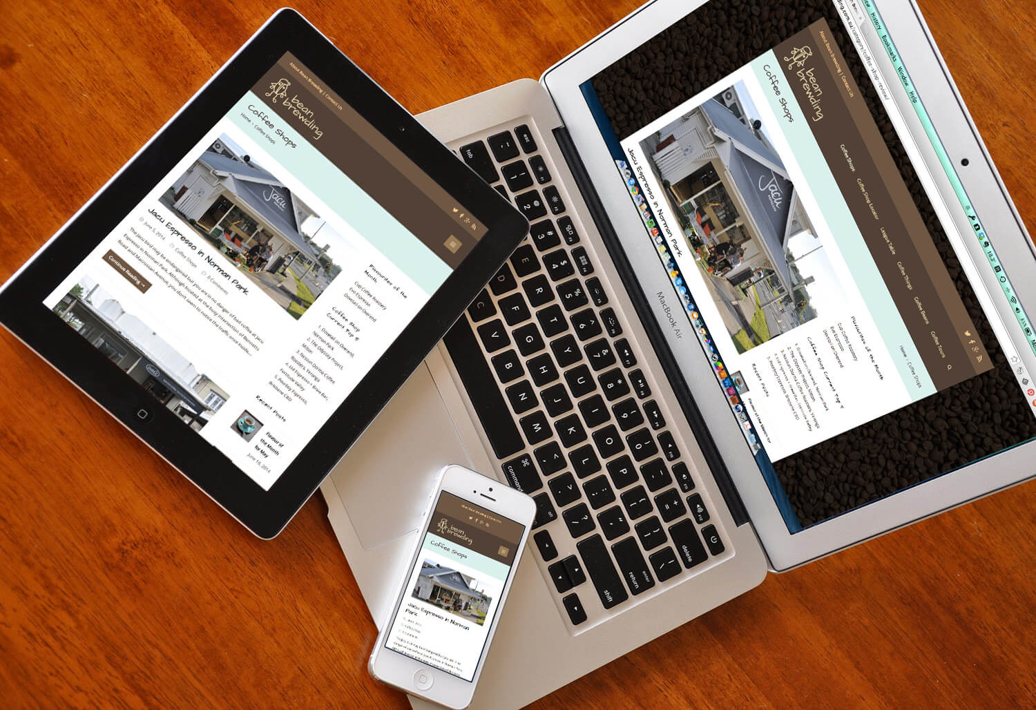
For a couple of years I joined the group to help develop the branding, build the new website, and take photos of the various cafés and roasterys we visited, as well as documenting the later coffee tours. The first step of the branding was to refresh the Bean Brewding logo. The logo was already working quite well and the little ‘bean dude’ was quite unique, so rather than reinventing it was evolved to be a little more refined, a little thicker to render correctly on Internet and mobile devices (particularly on social media as the profile picture and avatar), and the font was updated to one that would also work as a heading font on the new website.

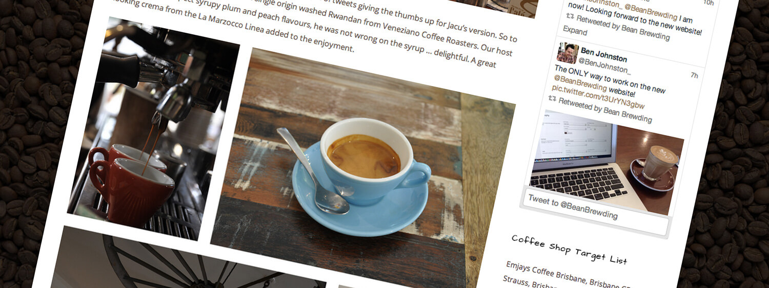
Once the logo was updated, colours, fonts, and photographic elements were selected and created to form the rest of the branding. This included a palette of browns with a contrasting ‘duck egg’ blue-green that became the highlight colour for the website elements. The website was put together as a responsive WordPress site that worked across desktops, tablets and mobile devices. It included sections for the coffee blog, coffee tours, and a coffee shop locator.
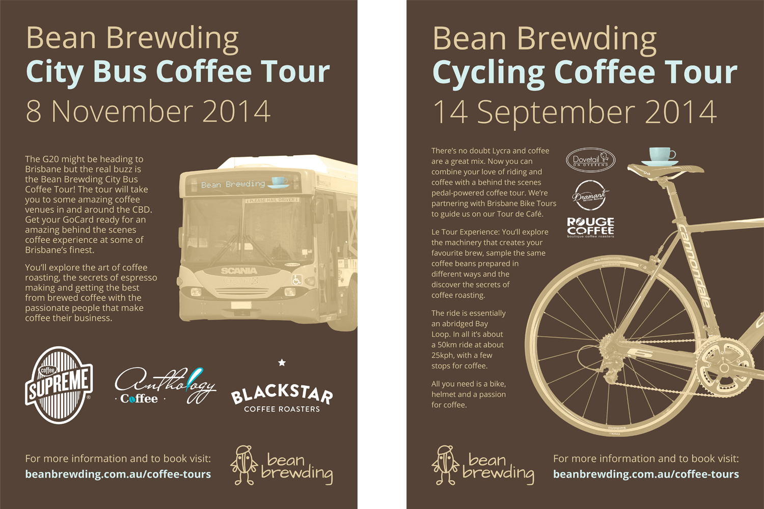
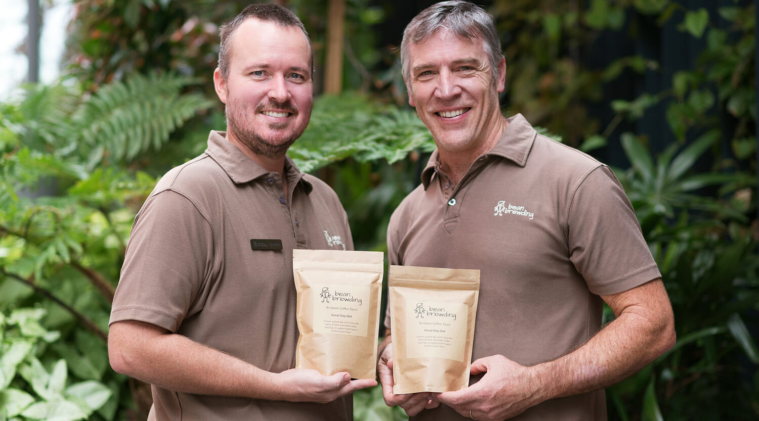
The same colour scheme and styling then translated into the various tour posters, flyers and other promotional material including shirts and name badges.
