
Acran Sound Control
messaging | logo design | brand identity | illustration | photography | website
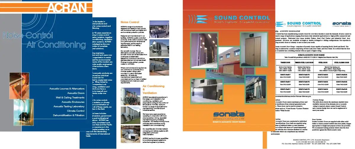
Acran has been engineering and manufacturing noise control and ventilation systems since 1978, and after acquiring the similarly experienced company Sound Control in 2019, the two businesses have operated under the one roof while externally appearing as two separate businesses. This included maintaining separate names, logos, phone numbers, email addresses, and two individual websites. Over time there were some hints that the two companies were linked, but the time had come for Acran and Sound Control to become Acran Sound Control and move forward into the future as one.

The two existing logos and colour schemes were quite different to each other, though perhaps by coincidence some of the marketing material used some of the same core colours which included orange and blue. The somewhat dated designs also didn't do the company justice, which in reality had expert engineers working on significant projects for noteworthy clients—all while manufacturing every single element on-site in Brisbane Australia.
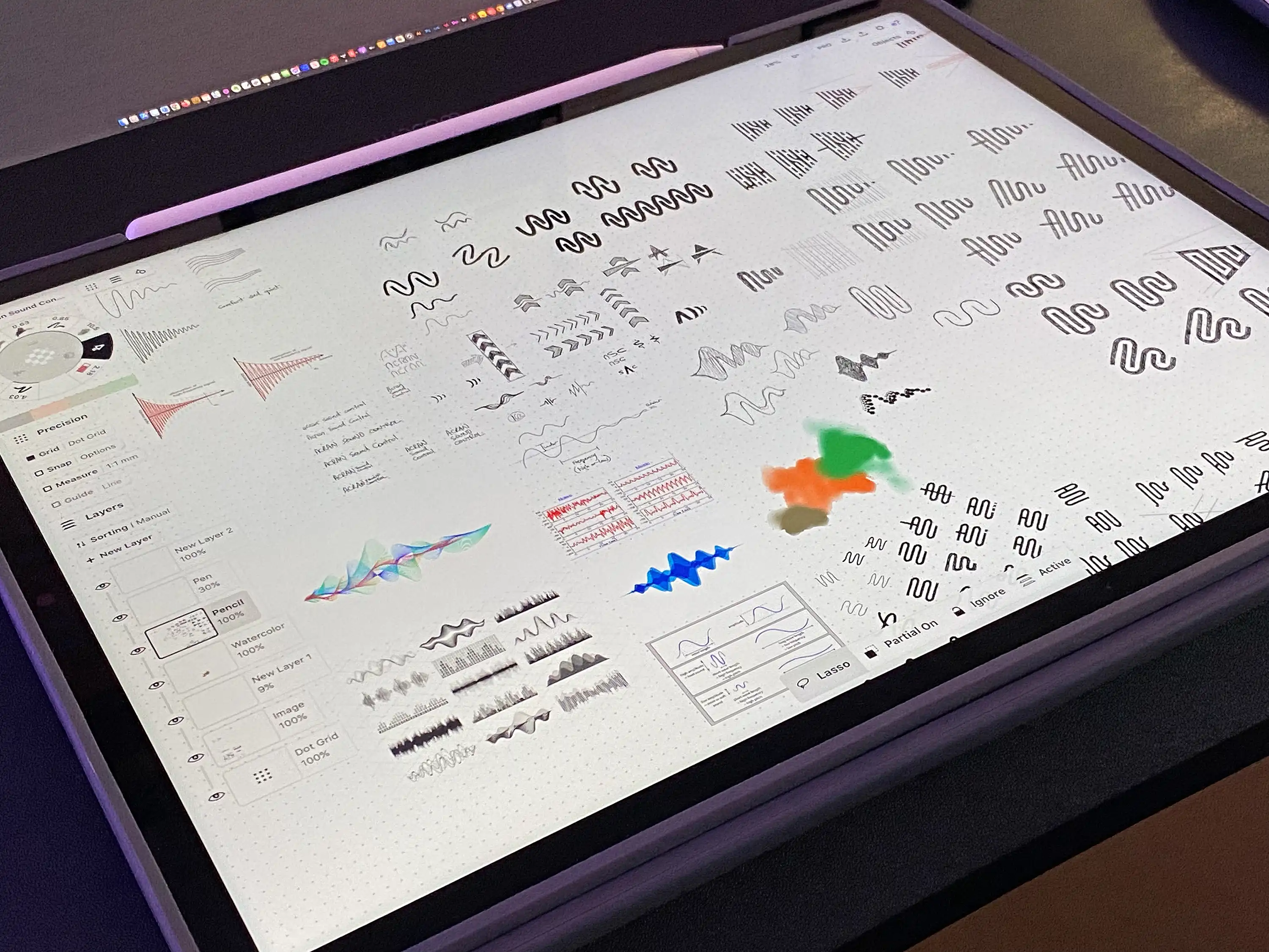
After an extensive discovery, strategy and messaging process, the design part of the project began with sketching out concepts and ideas for a new united logo. Working across various concepts, the key ideas that formed were the sound wave concept, and also the reduction concept. As such, many of the sketches included sound waves and squiggly lines that gradually reduced in amplitude to give the sense of sound being reduced. The challenge with most of these were they didn't really convey the procision and structural quality of Acran Sound Control's products.
This is when the vertical bars concept came into play. By varying the thickness of the bars the subtle sound wave remained while being contained in a strong and technical shape; making it look less organic and more engineered. In addition to the core sound attenuation idea, the left-to-right transition also found meaning with other aspects of Acran Sound Control including the process of narrowing down a design via engineering to arrive at an outcome, the process reducing heat and humidity, and also the reduction of impurities through the filtration systems.
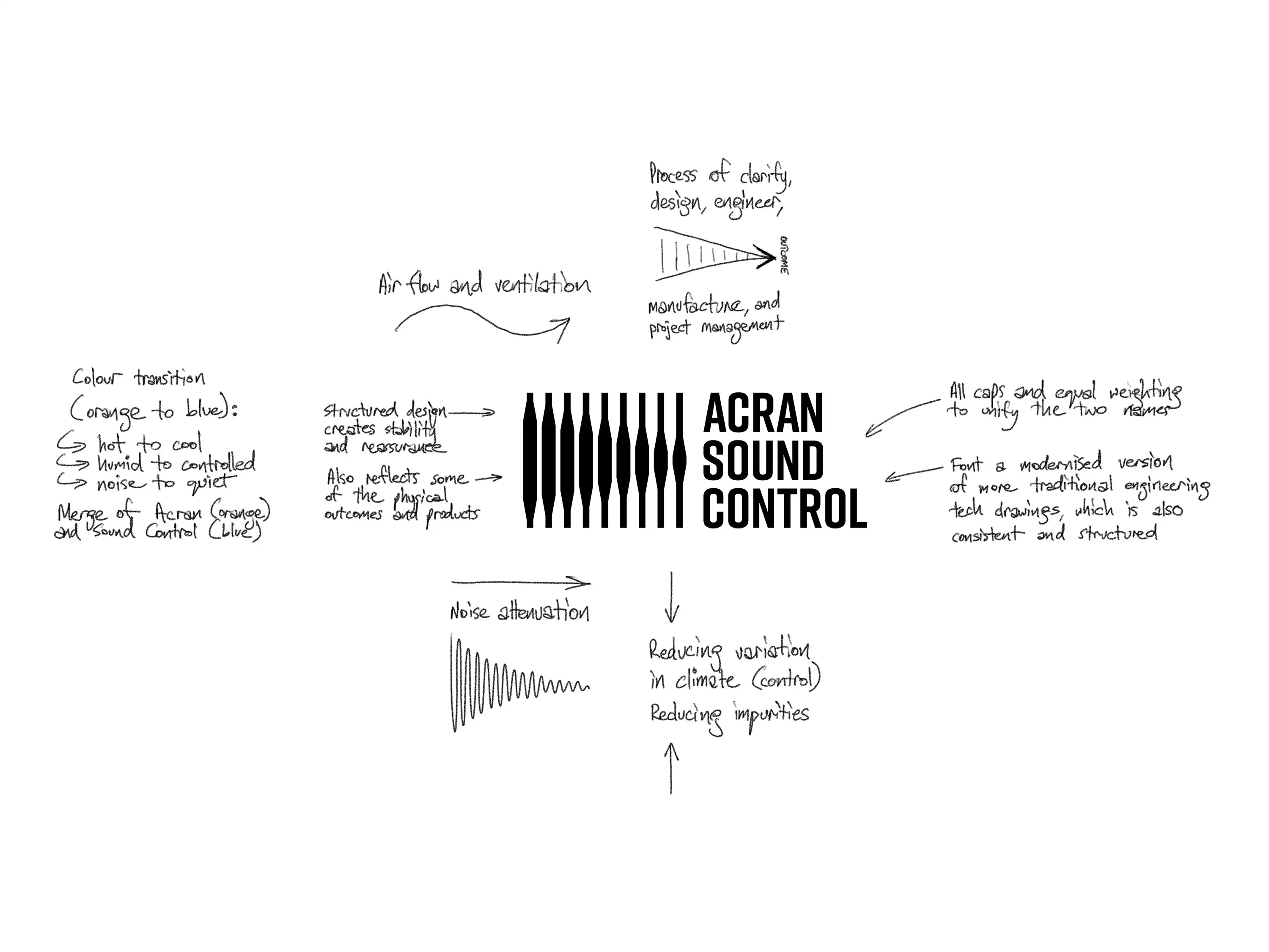
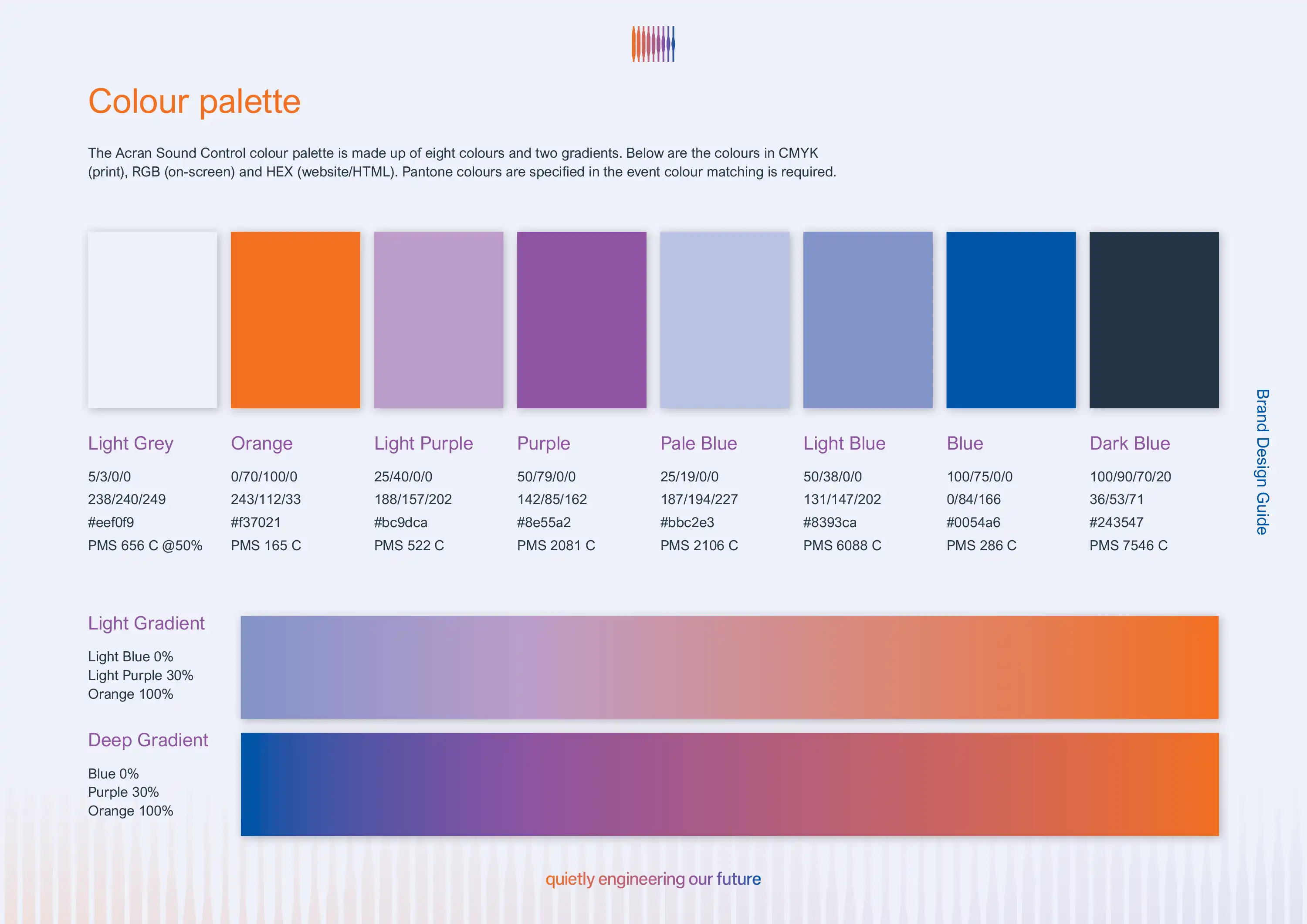
The idea of transition and transformation continued when adding in colour. Not only does the orange-to-blue gradient symbolise the integration of Acran (orange) and Sound Control (blue), but it also has connotations to transforming noise into quiet, hot into cool, humid into controlled, and contaminated into clean.
The logotype was deliberately equal in weight and scale, showing that both previous businesses are equally important, and that the companies were merging rather than one taking over the other. The typeface was selected as a modern interpretation of traditional tech drawing fonts, while also appearing consistent and structured in the way it sits together.

During the messaging and copywriting phase, the new 'quietly engineering our future' tagline was developed.
‘Quietly’ refers to the calm confident approach, the minimal noise from ASC’s products, and without drawing unnecessary attention or showboating. ‘Engineering’ refers to the company’s craft, but also using that expertise to contribute to the advancement and development of society, along with the protection and enhancement of the environment. ‘Our’ indicates a sense of unity and collaboration, making the mission bigger than ASC itself. ‘Future’ invites contemplation, planning and preparation for what’s to come. ‘Our future’ also has potential for change, progress, and new opportunities.
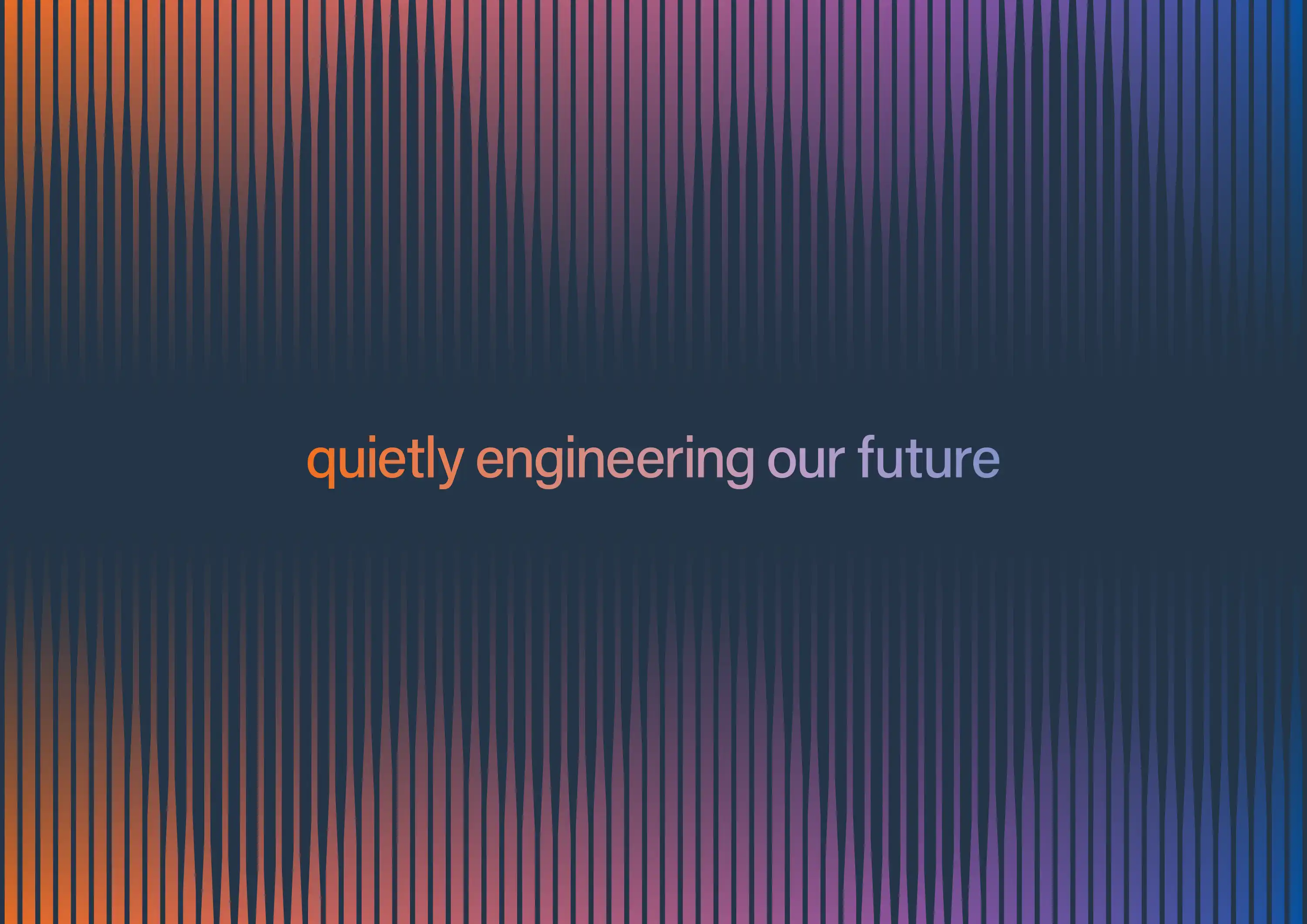
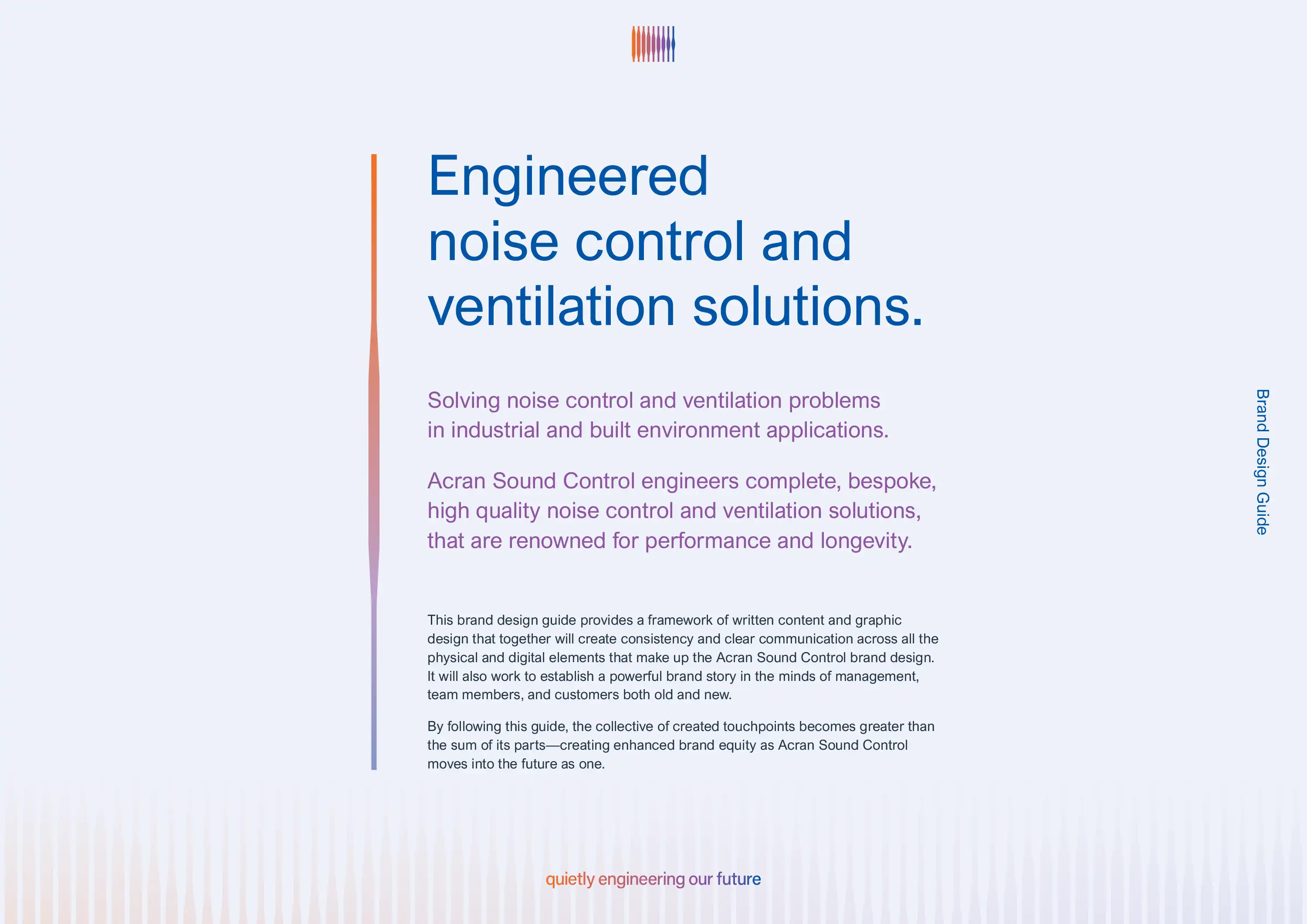
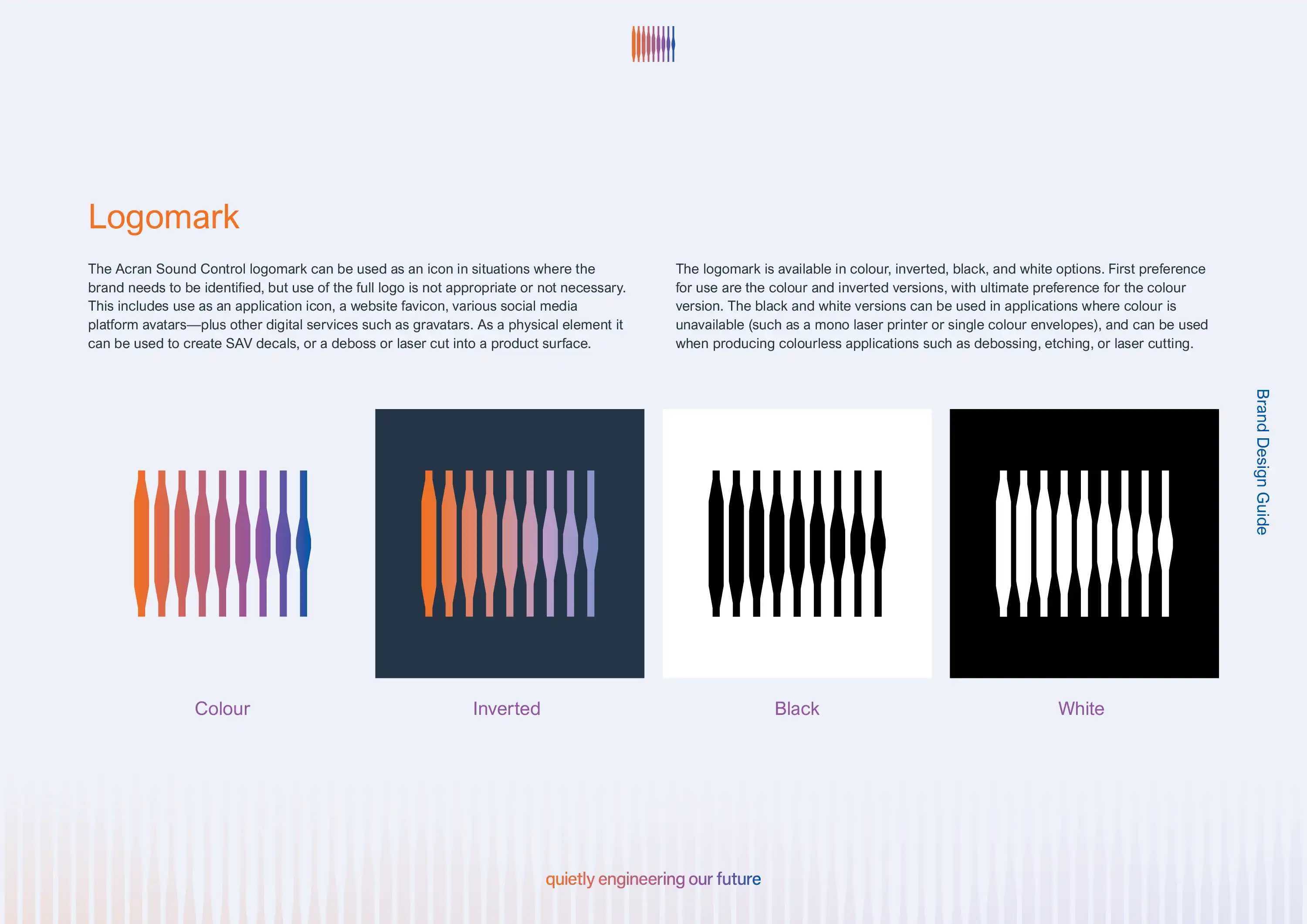
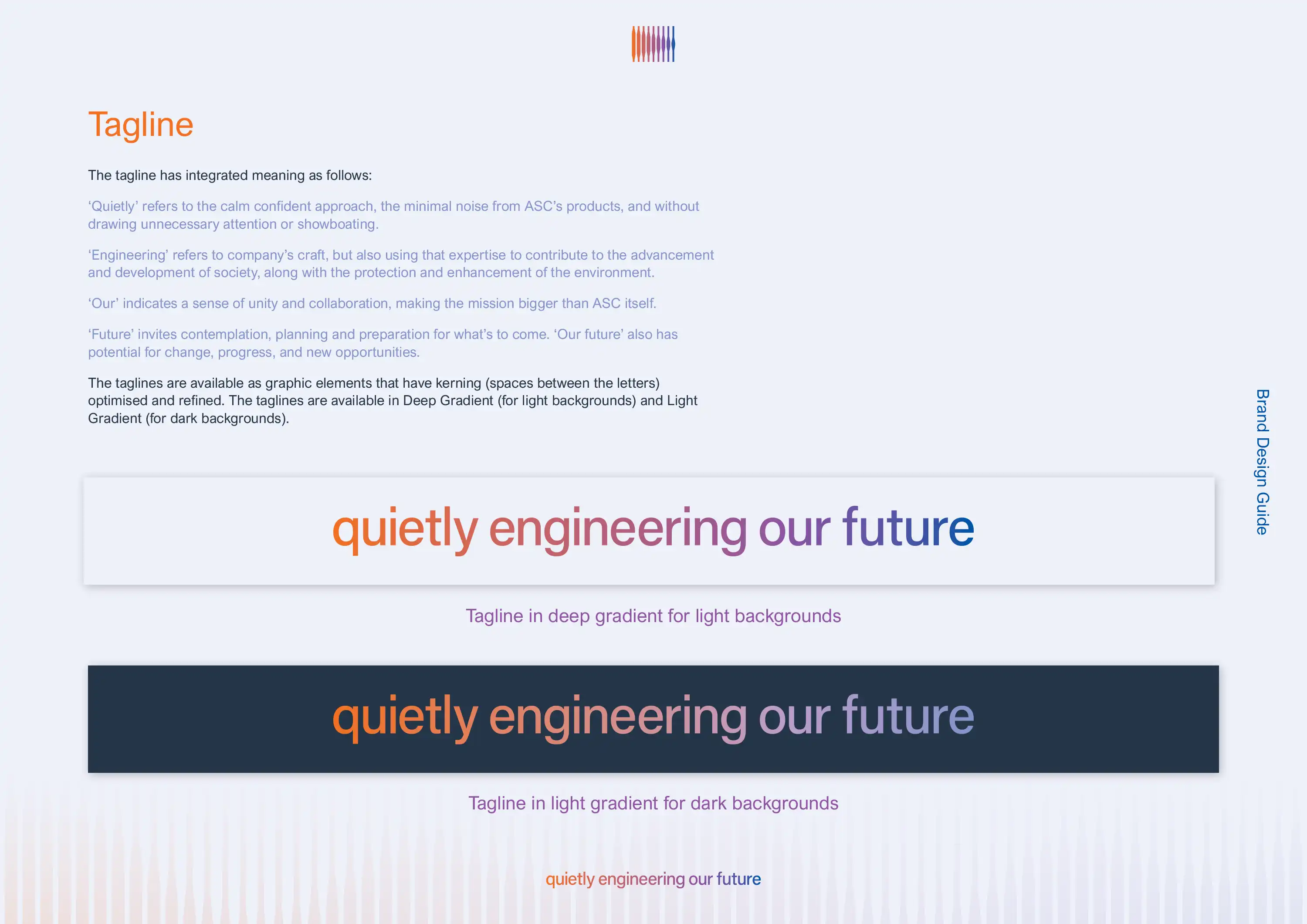
Additional elements were then created to further build the brand identity design, including a colour palette that extended on the two primary brand colours, a range of sound/air wave patterns that extend the design of the logo into a range of distinctive background and framing elements, and a single sound/air wave bar that's used as a branded divider device.
In addition to extensive new copywriting that describes each product in easy to understand language, we additionally created a collection of custom designed icons that describe what each of the products do while integrating the brand colours and playing on the orange-to-blue colour transition to illustrate the transformation of sound and air.
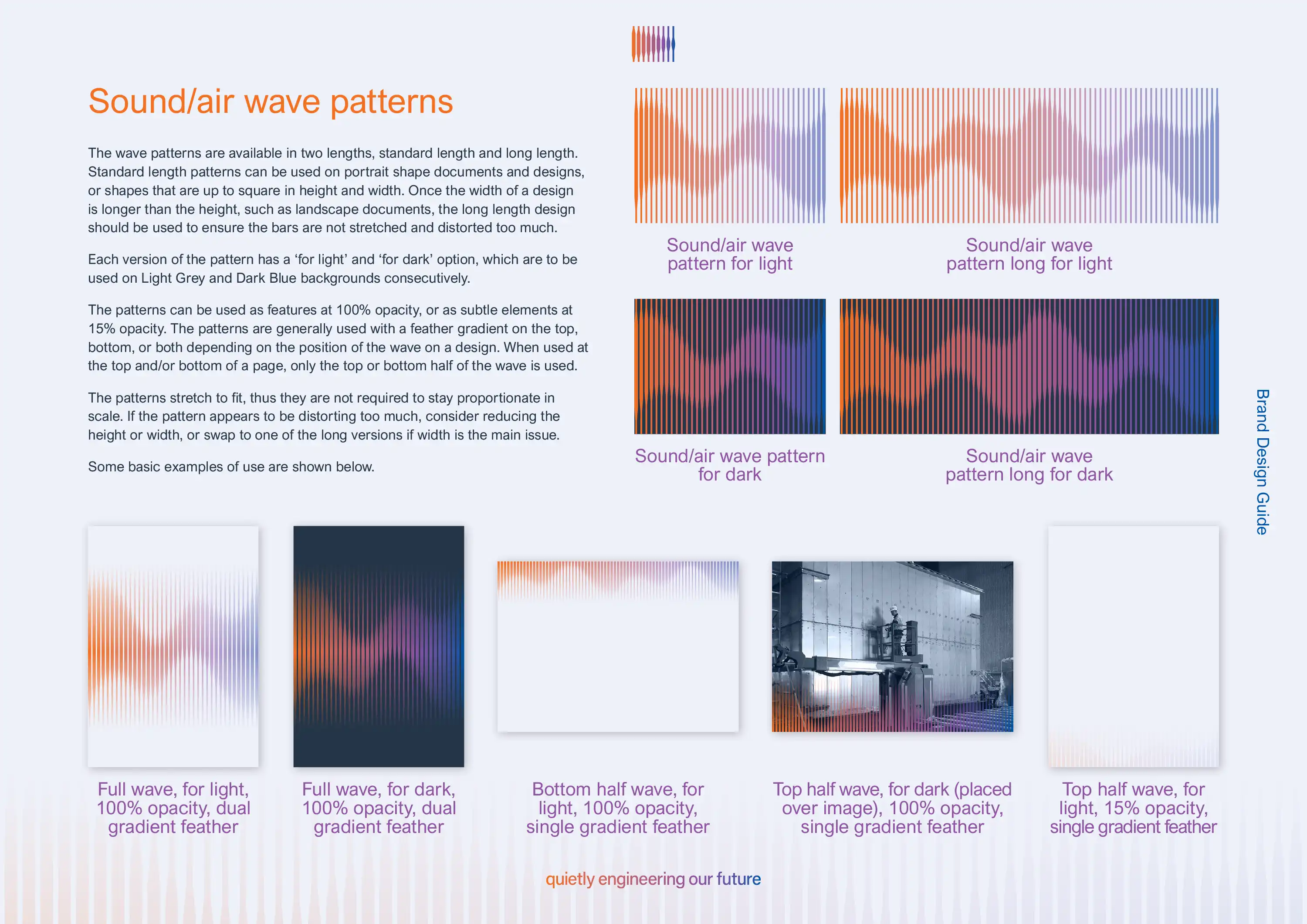


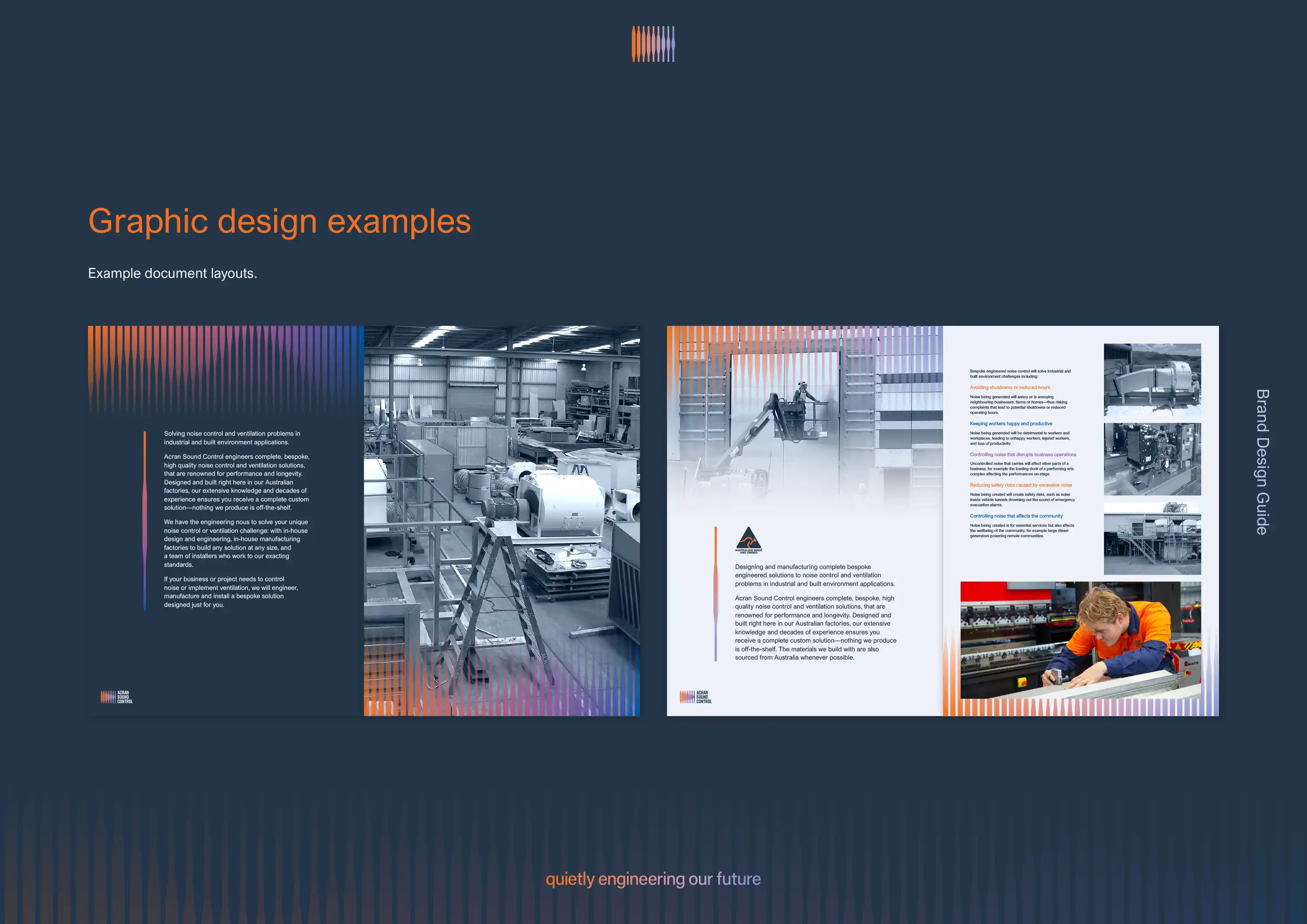
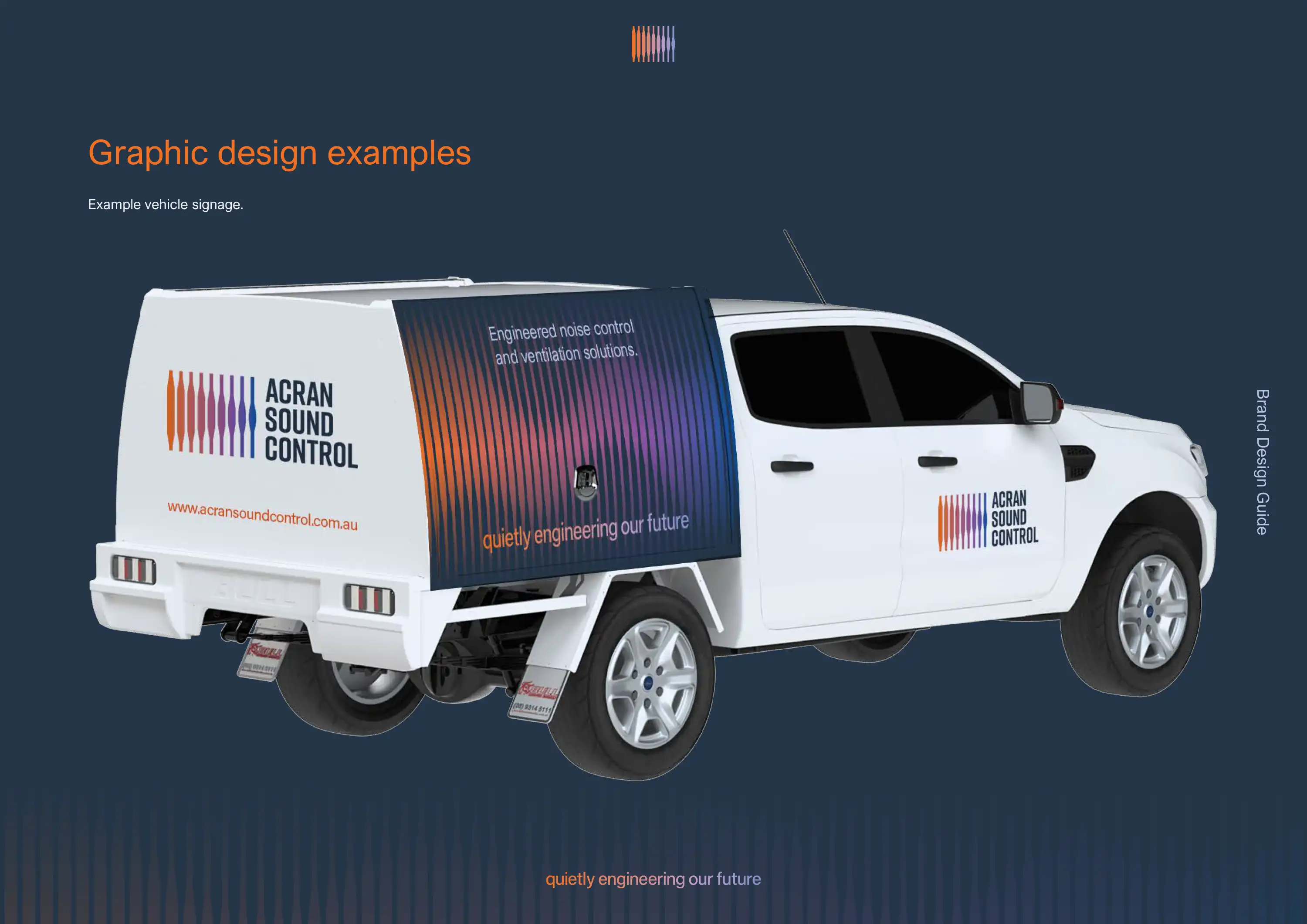
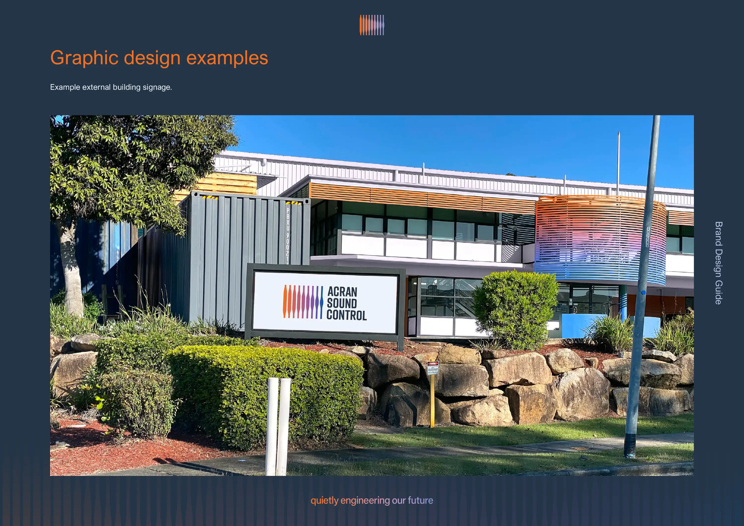
The brand design was then put into application through various graphic design and signage mock-ups—many of which have since been put into actual production and into documentation.
The application mock-ups included documents and document covers, business cards, letterheads, vehicle signage, external building signage, and a new Acran Sound Control website.

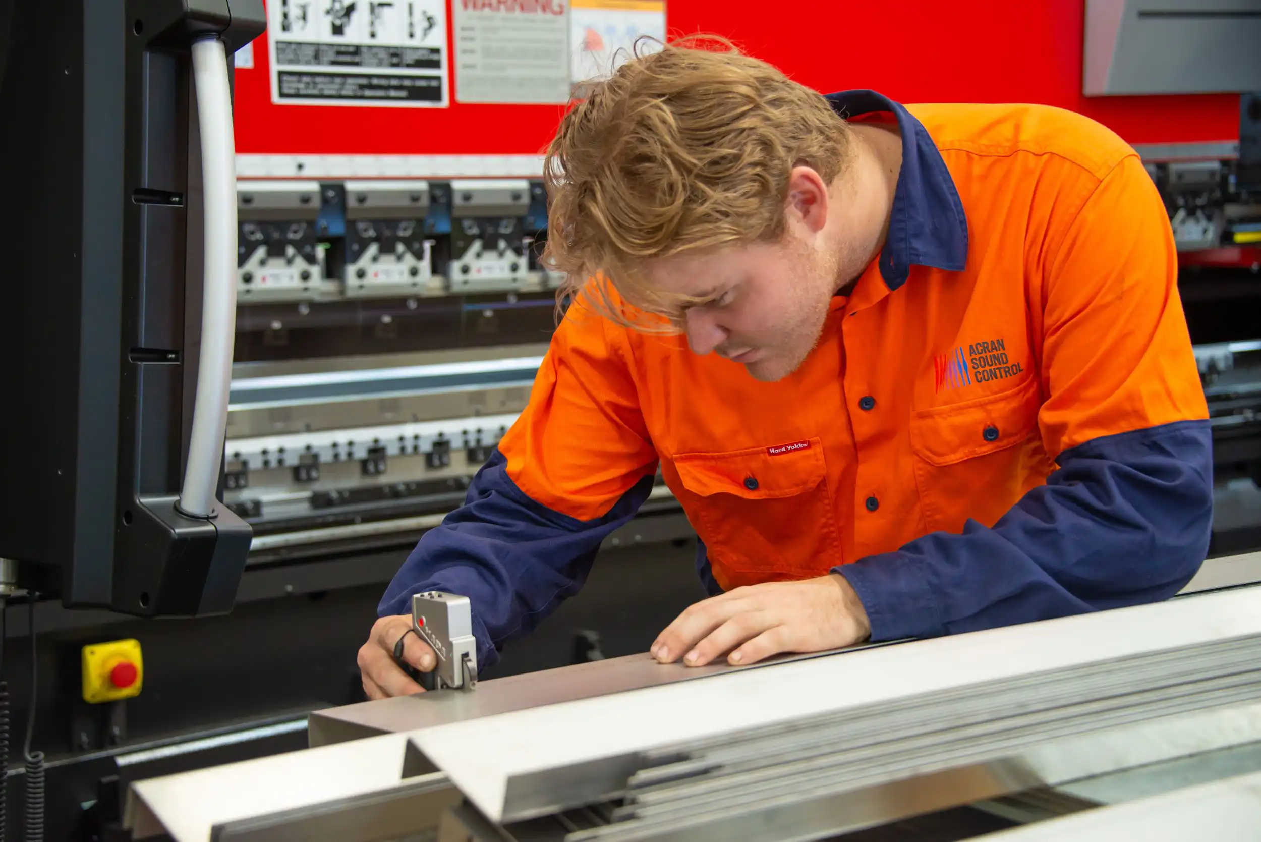
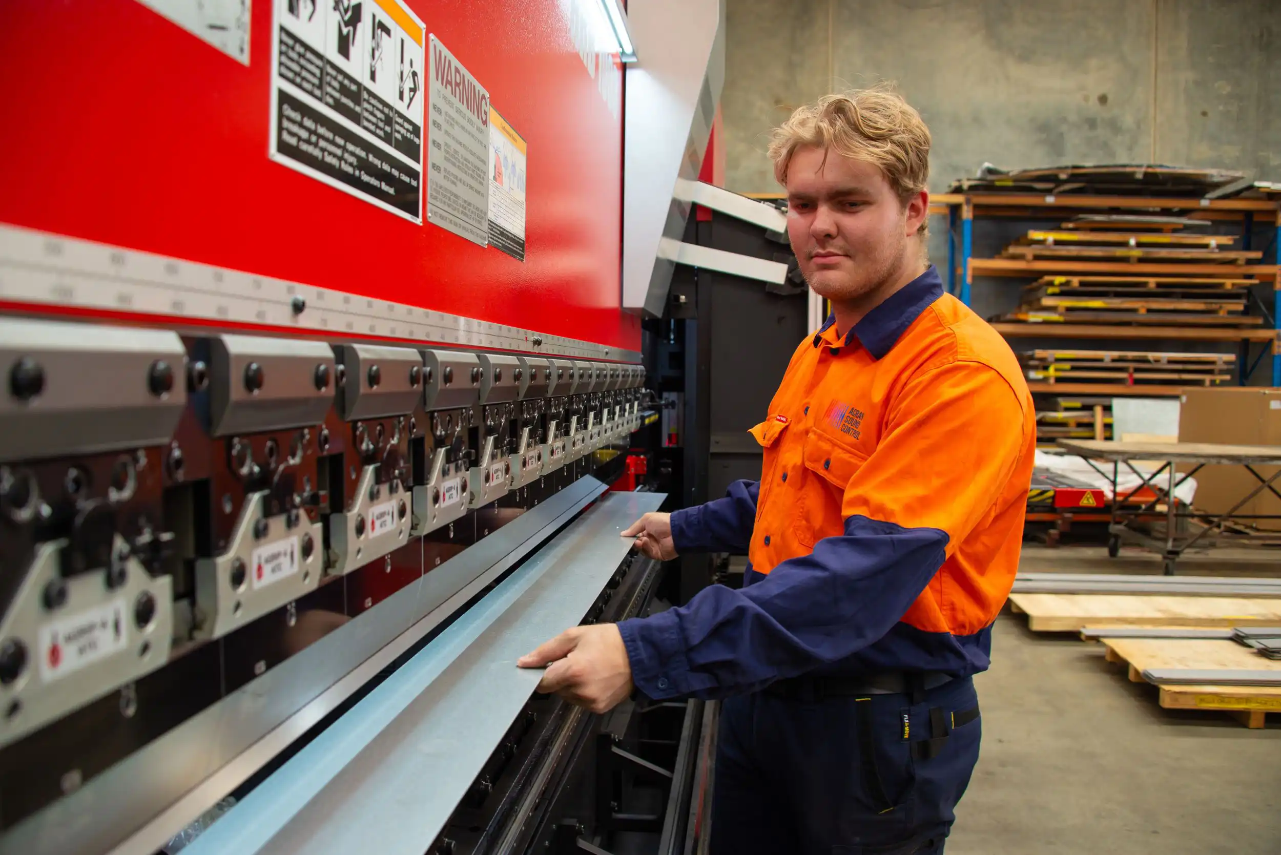
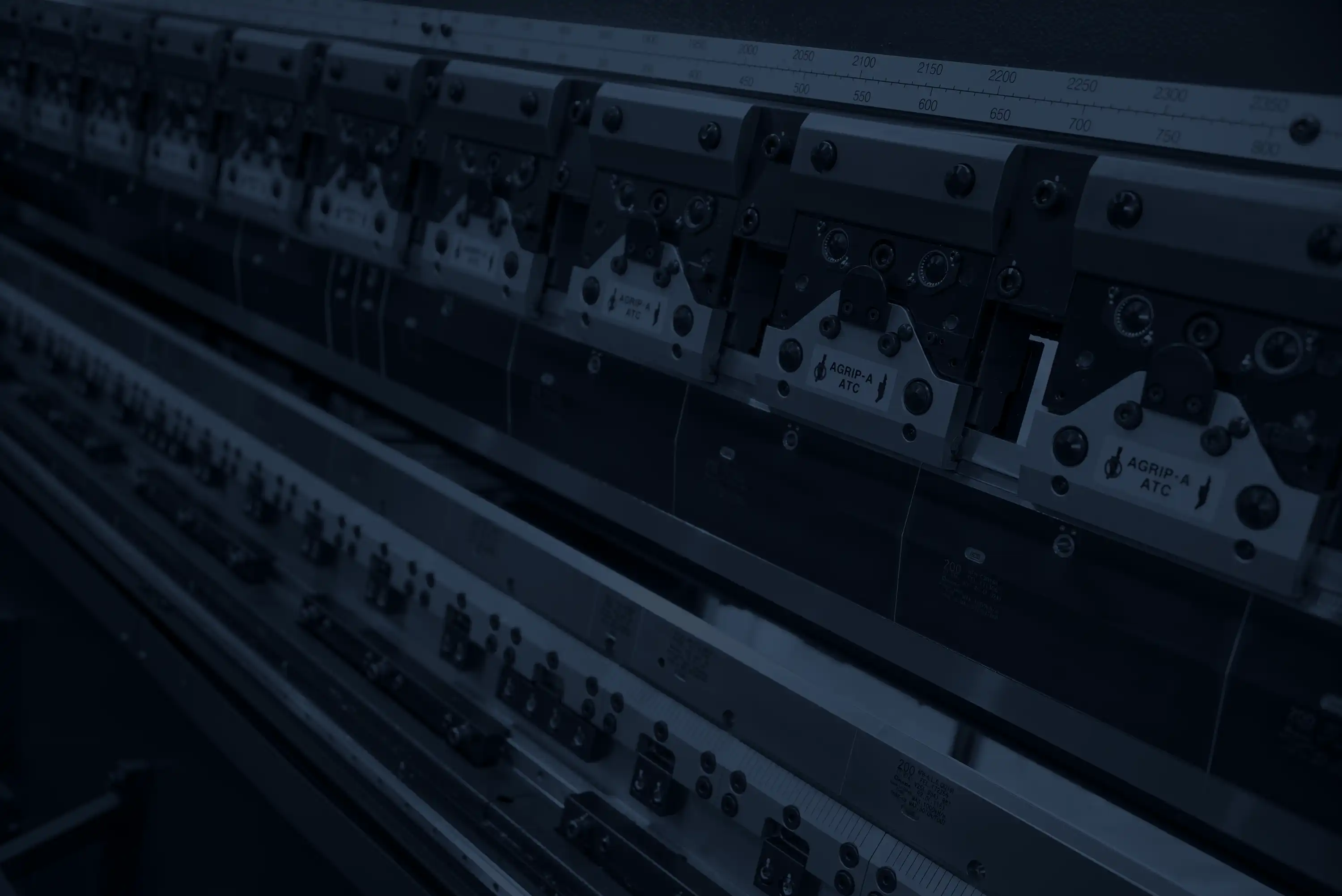
During the website build we undertook an on-site photoshoot which featured some of the newly screenprinted work shirts. Shots included actual employees working with the machinery and materials in the factory, various machines and aspects of the Brisbane-based factories, plus a range of textures that were later darkened and used as backgrounds throughout the new website design and build.





The brand design was then translated into a website that we designed and build on the Oncord platform. It not only tells the story of benefit-to-customer, it also showcases the extensive range of products in a logical and easy-to-find way. It also makes full use of the brand design elements including the sound/air wave bars, and the comprehensive collection of custom designed product icons.
The website also demonstrates the scale of the messaging process, with virtually all copy on the website being written or edited by Evocative during the WRITE phase.
You can visit the Acran Sound Control website here: acransoundcontrol.com.au

The end result from the brand design process was a distinctive and meaningful visual identity system that tells Acran Sound Control's story while bringing together the legacy of two long-standing Australian engineering businesses.
Operating under a single brand has not only simplified the benefits of the business and products in the eyes of customers, but it has set the internal tone for the business to move forward together as one.

In this Inspired by Evocative, Ben describes the process behind creating the Acran Sound Control logo. Three years after Acran acquired Sound Control, Evocative worked on a logo and brand design that would unify the two brands, and get Acran Sound Control ready for its next phase of growth.

