![]()
Agile Electrical & Data
brand design: messaging | naming | logo design | brand identity | website design and build
Owner and operator Chris and his business partner wife Christina approached us after Chris attended one of our ‘purpose-driven companies’ presentations, with an interesting challenge. While there was the bones of a brand that had been built up over many years—including a logomark that Chris and Christina created together—a crucial issue they were having was in the name. ‘Power by Professionals’ was the full name, which due to its length and number of syllables had been shortened to PBP. This was proving to be difficult for customers to remember, and significantly it was difficult to hear and understand over the phone. As Chris’ business relies almost entirely on word-of-mouth referrals this was a bigger problem than first realised.
The first step in the brand design process was to undertake a discovery session as part of the OUTLINE phase, which then informed positioning, messaging and initial wordmapping. The wordmapping created a range of descriptions and themes around which a new name could be created. Finding names that aren’t already taken in an industry awash with owner operators proved particularly challenging. After several shortlists and close collaboration with the client, it was Chris that suggested the name ‘Agile’. After some initial checking for name availability we then assessed the name for suitability against the new positioning and messaging we’d created.
After careful consideration of the various aspects of the brand, the Agile name was approved.
'We remain alert, clever and always ready to educate our clients. We rise to any challenge and are lively in our approach. Electrical and data are descriptors, but are also a representation of the future direction of Agile; as smart homes and businesses evolve, Agile will evolve to keep up with the latest in technology.'
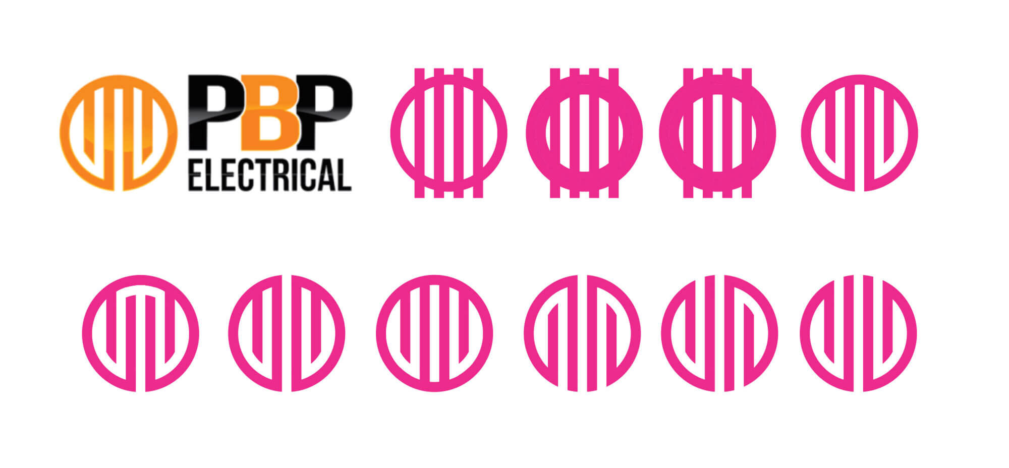
It is a lot easier to say and remember than ‘PBP’, and can be referred to as simply ‘Agile’ with ‘electrical & data’ becoming more of a descriptive tagline. During the OUTLINE phase it was decided that the logo needed to be updated with the new name and refined in terms of style and appearance. The existing logomark not only had brand equity as the most recognisable part of the brand design, but it also had personal significance and meaning to the owners.
We took the approach of simply updating and refining the logomark to then create and add a new logotype to form a complete logo. We tested a range of logomarks to create better balance and visual appeal without losing the essence of the original mark. We also updated the somewhat dated ‘gloss’ look with a more elegant orange gradient.
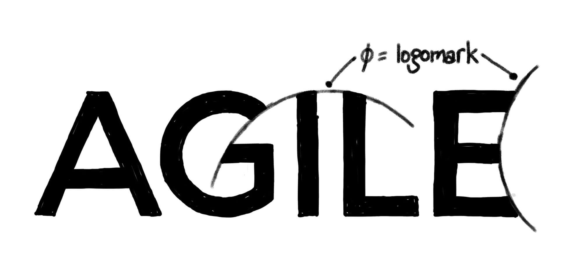
The logotype began as hand-drawn type that featured a unifying curve through some of the letters. Once vectorised in Illustrator, the curve changed to run from the return of the ‘G’ right across the ‘I’ and ‘L’. The curve matches the curve of the logomark, as does the curve that’s integrated into the arms of the ‘E’.
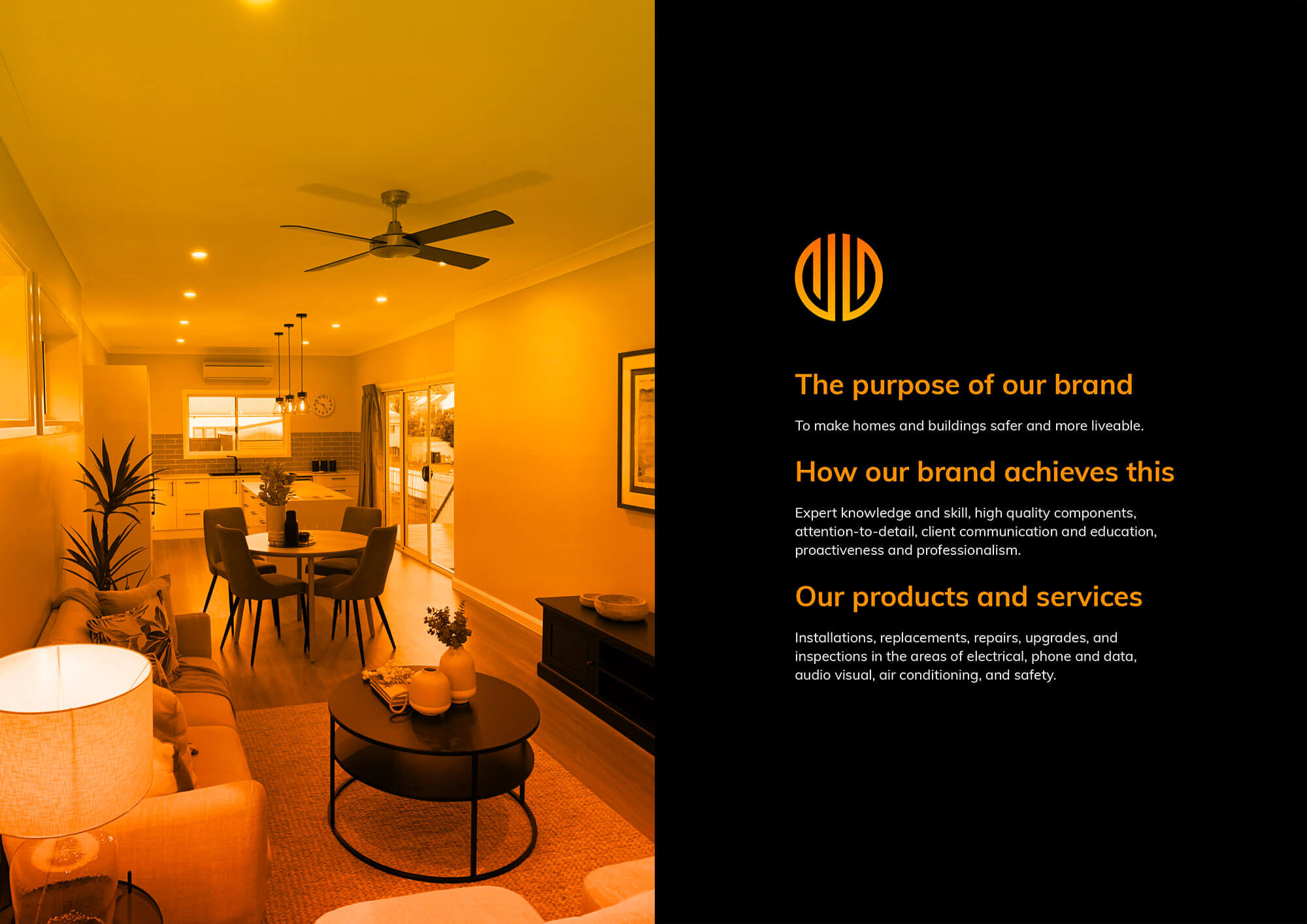
The updated logomark is made up of two symmetrical parts; symbolising various aspects of Agile that go hand-in-hand: electrical and data, customer and professional, education and technical skill, safety and liveability. There is also a nod to the four members of the founder’s family—a key aspect of why Agile was created in the first place.

Underpinning the name, logo and messaging is the brand’s purpose, process and products. The purpose is hugely important as it creates clarity while not boxing the business into a particular category or service. In Chris’ case his highly evident interest and passion for home automation and connectivity fits perfectly into his brand’s purpose:
'To make homes and buildings safer and more liveable.'
This purpose allows Chris and Christina to make strategic business decisions in terms of ideal clients, products and services, operations, and future planning. It also helps them connect with customers that share values with the business, and in the future attract and engage employees that believe in and are motivated by the purpose.
Once the name, logos and core messaging were created, a brand design guide was created to ensure clarity and consistency for every aspect of the new brand design. The brand design guide contains the vision and brand purpose, brand positioning and messaging, logo design and use, name and tagline conventions, typography, colours, supplementary design elements, and examples of photography style.
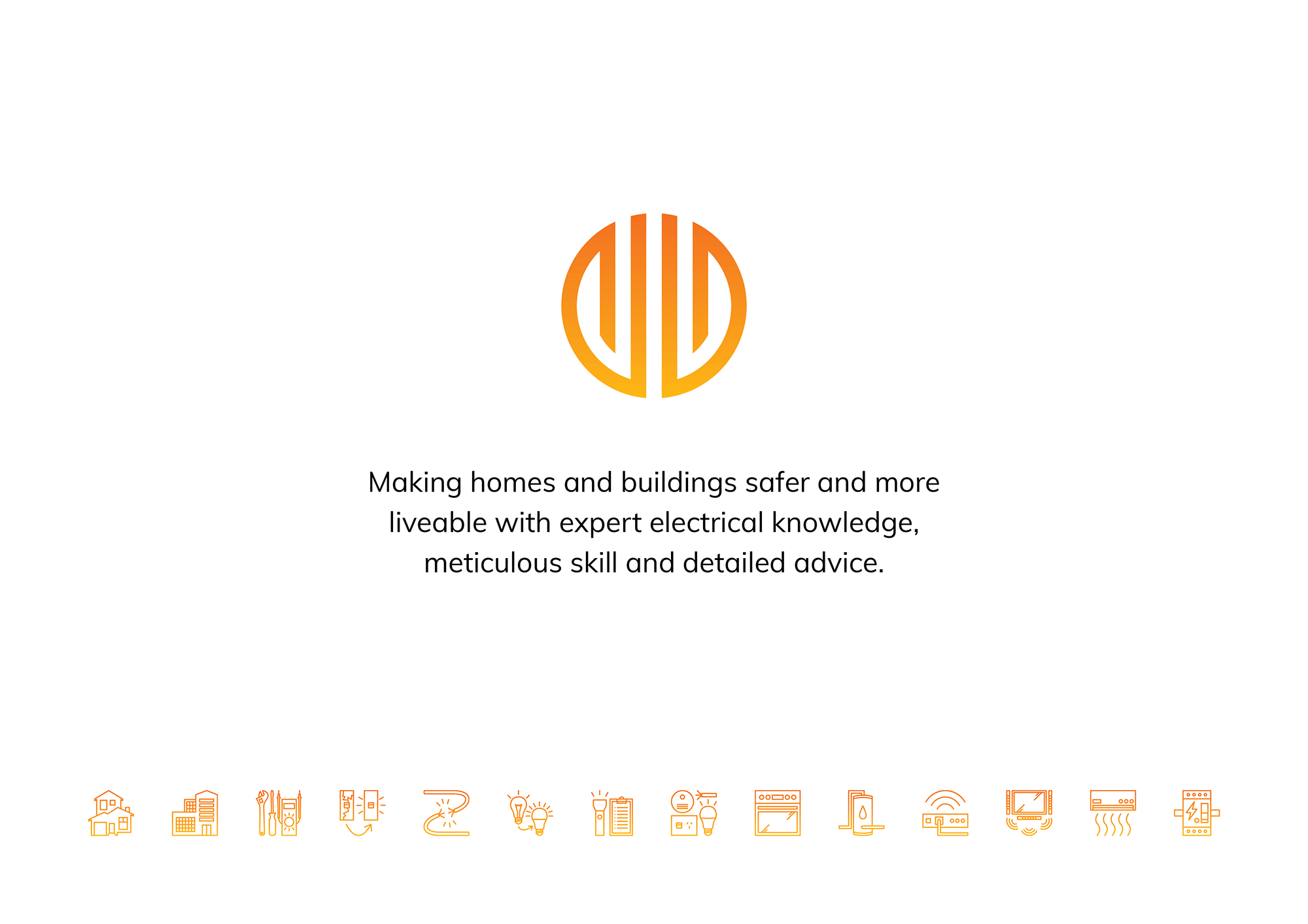
In the Agile brand design, some of the supplementary design elements included a range of custom-designed icons that tell the story of the services. These are broken up into three sections: key markets, services, and applications. The icon design process went from initial rough sketches, right through to creating icons that not only match each other, but all fit perfectly into a square space. This creates uniformity and consistency which builds visual trust and connotations of professionalism. The icons can be used individually or as a set to create a border or pattern.
In the CREATE phase the brand design, messaging and graphic elements were then translated into the new website, which we created on the Oncord platform. The site showcases the messaging and icons while going into more detail on each of Agile's services. There's also a comprehensive FAQs section, legal pages, plus a unique service area dropdown system allowing potential clients to quickly look up their suburb name.

As Chris and Christina continue to roll out the new brand design, an example of the style guide at work is the van livery that was created and installed by an independent third party supplier. Having the right brand design assets and the style guide to refer to, the brand consistency continues to build no matter the application or agency doing the work.
You can visit the Agile Electrical & Data website at www.agileelectrical.com.au and follow them on Facebook, Instagram and LinkedIn.